
Wreath, Crest, or Frame? Choosing a Monogram Style for Address Labels
Posted by Affordable Address Labels on Feb 9th 2025
A monogram can make an address label feel established and personal, but the surrounding shape changes the mood. Wreaths feel soft and botanical, crests feel traditional, and geometric frames can look modern or formal.
The best choice supports the names and address instead of competing with them. Consider the amount of text, envelope style, and occasions where the label will be used.
Choose a wreath for softness and versatility
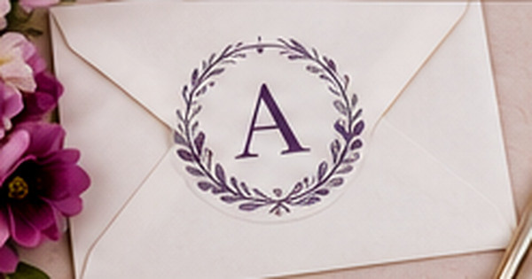
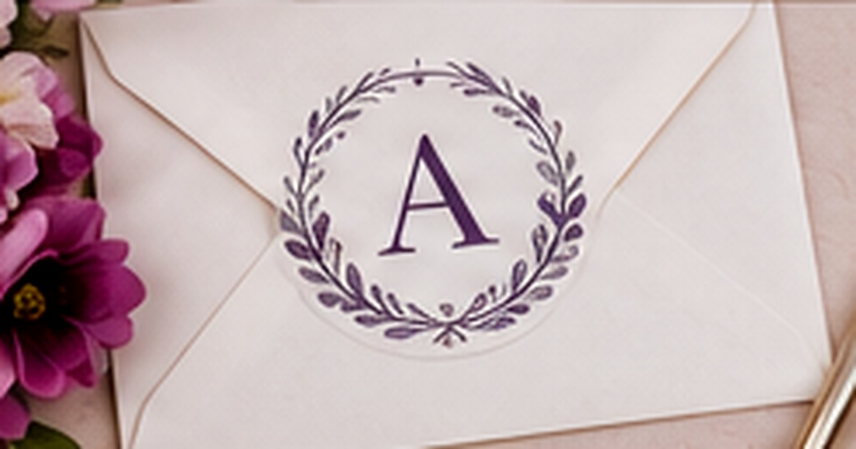
Leaf, floral, and laurel wreaths create a welcoming frame around an initial. They work well for weddings, family stationery, and everyday correspondence because the botanical shape can be formal or relaxed depending on the drawing. Keep the wreath open enough that the initial remains clear. Dense foliage may lose detail at small label size, especially when printed in a light color.
Choose a crest for tradition and structure
Crests, shields, and heraldic shapes suggest history and formality. They can suit a shared surname, professional household, or classic stationery wardrobe. Avoid adding too many symbolic elements inside a small crest. A single initial, date, or simple line motif is usually enough. Pair the crest with readable typography so the label does not feel like a decorative seal without practical information.
Use a geometric frame for a clean modern result
Circles, squares, arches, and thin-line frames provide order without adding a strong theme. A geometric frame can make a simple initial feel intentional and works especially well with sans serif or refined serif type. The frame should not squeeze long names or addresses. If text extends beyond it, consider using the frame only around the monogram and keeping the address in a separate aligned block.
Match the monogram scale to the label shape
A round wreath may fit naturally on a square or oval label, while a horizontal rectangle often benefits from a smaller monogram beside the address. Check how much space remains after the longest address line is added. The monogram is an identity accent, not the main mailing information, so reduce it when necessary to preserve clarity.
Keep initial order and household identity accurate
Decide whether the monogram represents one person, a couple, or a family. Initial order traditions vary, and modern households often choose the arrangement that feels most natural. Confirm that everyone is comfortable with the surname or initials before printing. A beautiful frame cannot correct an identity format that feels wrong to the people using it.
A proportion example
On a horizontal label, a small laurel wreath with one initial may sit to the left of a three-line address. On a square label, the wreath can move above the address and become slightly larger. A crest with several symbols would require more room and may work better on the card itself. Testing the same monogram in different shapes shows which version keeps both identity and mailing information in balance.
Common monogram-frame mistakes
Avoid forcing three initials into an ornate crest when they become unreadable at print size. Do not use a wreath so dense that it looks like a dark circle. Frames should not touch the address text or create awkward line breaks. Confirm the initial order and surname presentation before ordering, especially for couples and blended households where traditional assumptions may not reflect preference.
Do one real-world review before finalizing
Before committing to the final approach, create one complete sample using the actual materials, names, address details, containers, or stationery involved in monogram style for address labels. View it in normal light, handle it the way a recipient or household member would, and ask another person what they notice first. This last review catches small problems with scale, wording, placement, and usability. Record the approved choices so a future reorder or update begins from a tested version rather than an old draft or memory.
Quick checklist
- Choose a frame style that matches the desired mood
- Keep small artwork simple enough to print clearly
- Scale the monogram around the longest address line
- Confirm the initials and household format together
Frequently asked questions
Is a wreath monogram only for weddings?
No. A restrained botanical wreath works well for year-round family and individual stationery.
Do crests need several initials?
Not at all. A single letter or surname can look cleaner and reproduce better at address-label size.
Can a modern label use a monogram?
Yes. Simple geometry, one initial, and clean typography create a contemporary monogram style.
Put the plan into practice
A thoughtful system is easier to use when the design and supplies support the real task. Explore personalized address labels to create coordinated pieces that remain clear, practical, and personal.