
Winter Address Label Ideas Beyond Traditional Christmas Red
Posted by Affordable Address Labels on Nov 9th 2024
Red is familiar in holiday mail, but winter stationery has a much broader palette. Deep blue, evergreen, white, burgundy, plum, silver-gray, warm kraft, and soft blush can all create a seasonal feeling without repeating the same traditional combination.
Alternative winter designs are especially useful for households that send cards across multiple holidays, prefer a quieter style, or want leftover labels to remain useful through January and February.
Build the season through atmosphere
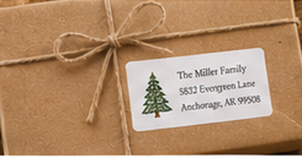
Snowflakes, bare branches, evergreen sprigs, stars, berries, winter florals, mountain silhouettes, and simple geometric patterns can suggest the season without naming a holiday. Choose one visual cue and leave enough open space for the address.
A limited palette often feels more sophisticated than many competing colors. Deep navy with white, evergreen with cream, burgundy with blush, or charcoal with a metallic-inspired accent can create strong seasonal contrast.
Design for the envelopes already in the card order
A beautiful label can lose impact when the envelope color is an afterthought. White labels provide control on dark red, forest green, navy, and patterned paper. Clear labels work best when the envelope is light enough to preserve text contrast.
Print a full-size sample and place it on the actual envelope. Winter colors can appear much darker in print than on a bright screen, especially under warm indoor lighting.
Separate holiday-specific and winter-general quantities
Labels with a year, greeting, Santa motif, or specific religious wording should be ordered from the current card count. More general evergreen, snow, star, or botanical designs can be ordered in a slightly larger quantity because they remain useful for thank-you notes and winter birthdays.
Record how many labels remain after the season. That information is more reliable than estimating from the original order when planning the following year.
Keep the address stronger than the decoration
White script on a dark field can be elegant but requires adequate size and printing quality. For compact labels, use a clean light typeface or reserve script for the household name while keeping the address in a simpler style.
Avoid placing snowflakes, berries, or branches directly behind small characters. Decorative edges and corners preserve the winter mood without disrupting the postal information.
Plan the labels through the end of winter
Divide the expected supply among pre-holiday cards, gift thank-you notes, January correspondence, winter birthdays, and any seasonal business mail. A general snow, evergreen, or star design can continue through those uses, while a label printed with a specific greeting or year may stop feeling appropriate immediately after the holiday.
Store remaining labels with a note showing the quantity and matching envelope colors. When the next season arrives, check the existing stock before ordering another similar design. This simple inventory step reduces waste and helps the household build a coordinated winter collection rather than a drawer of nearly identical leftovers.
Review the label beside the postage or seasonal stamp that will be used. Two detailed winter illustrations can compete in a small area, while one decorative element and one simple element usually feel balanced. Treat postage as part of the composition even though its exact design may vary during the season.
If several family members send cards, choose a design that all of them can use without feeling overly formal or overly playful. A shared neutral winter motif often reduces duplicate supplies and keeps the household mailing style consistent.
Quick checklist
- Choose one winter atmosphere or motif
- Use a limited high-contrast palette
- Test on the actual holiday envelope
- Order dated designs from the current list
- Keep general winter extras for thank-you notes
- Protect the address area from busy artwork
Frequently asked questions
What colors feel wintery without red?
Navy, evergreen, icy blue, white, burgundy, plum, charcoal, silver-gray, and natural kraft all support winter designs.
Can winter labels be used after the holidays?
Yes, when the design uses seasonal botanicals, snow, stars, or neutral patterns rather than a specific holiday greeting.
Should metallic effects be used for the address text?
Metallic-inspired accents are usually safer in borders or artwork. The address should remain high contrast and easy to scan.
Use winter color to create a distinct seasonal voice
Winter mail can feel festive without defaulting to the same red-and-green formula. Explore seasonal address labels and pair them with holiday and winter greeting cards in a palette that remains readable and useful after December.