
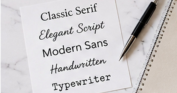
Serif, Script, or Sans Serif? Choosing Type for Small Address Labels
Posted by Affordable Address Labels on Mar 23rd 2024
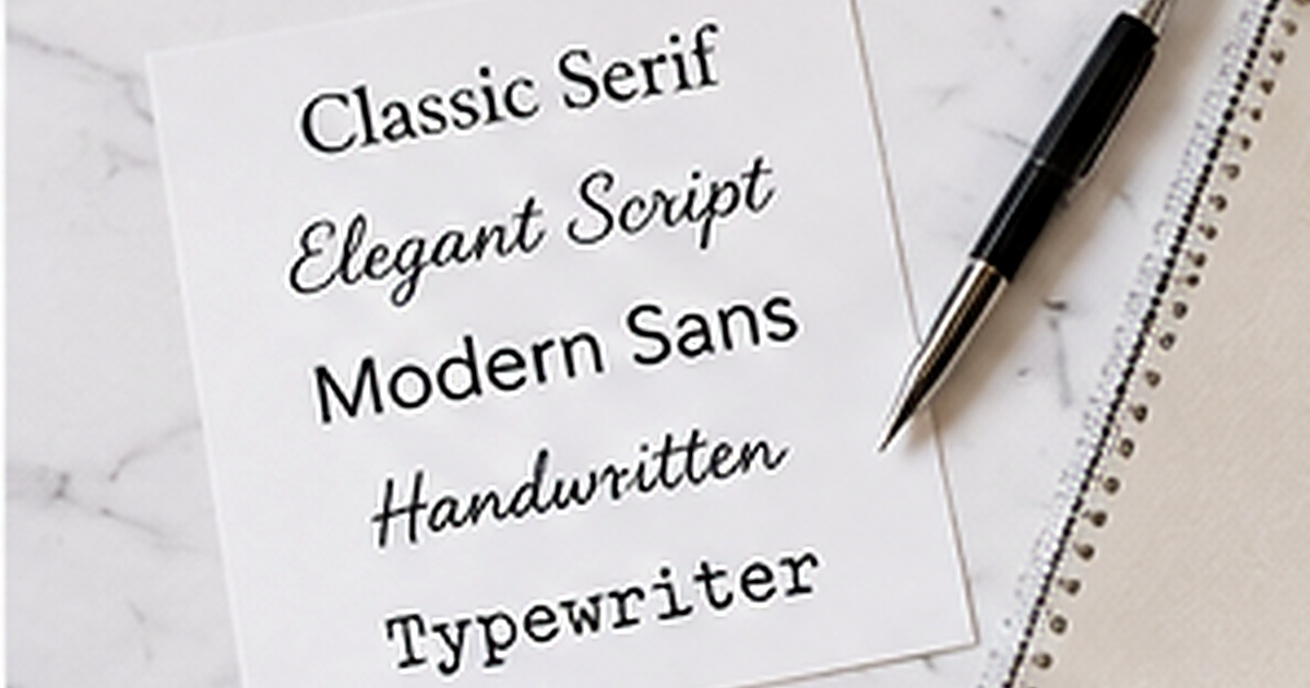
A font can make an address label feel traditional, modern, playful, or formal, but small print changes the rules. Fine strokes disappear, tight letters close up, and decorative capitals can become hard to distinguish when a design is reduced to envelope size.
The most effective label often uses two type roles: a characterful style for the name and a highly readable style for the street, city, state, and ZIP code. Understanding how the major font categories behave makes that pairing easier.
Serif type: traditional and steady
Serif fonts have small finishing strokes that can give a label a classic, literary, or formal look. Medium-weight serifs usually reproduce well, especially when the letters are not overly condensed. They are a strong choice for family labels, wedding stationery, and traditional monograms.
Avoid very thin “hairline” serifs at small sizes. On some printers and papers, the thinnest parts can break or look uneven. A slightly sturdier face preserves elegance without sacrificing clarity.
Sans serif type: clean and flexible
Sans serif fonts remove the finishing strokes and often provide excellent readability in compact spaces. They work well for modern, minimalist, business, and gender-neutral designs. A regular or medium weight can remain clear on textured and colored papers.
Very geometric styles may need extra letter spacing, while narrow condensed styles can save room on long addresses. Test capital I, lowercase l, and the number 1; they should remain distinguishable in names and unit numbers.
Script and handwritten type: use as an accent
Script can add warmth and personality to a family name or short word, but it should rarely carry the entire address. Connected strokes, flourishes, and unusual letterforms become harder to read when the type is small or the ink spreads slightly.
Choose a script with open letter shapes and moderate contrast. Pair it with a simple serif or sans serif for the address lines. If a surname is long, reduce flourishes before reducing the type to an unreadable size.
Evaluate the proof like a printed object
Zooming in on a screen hides real-world limitations. Print the proof at 100 percent or view it on a ruler-sized mockup. Hold it at normal reading distance and ask someone unfamiliar with the address to read every line.
Check contrast, spacing, and line breaks along with font choice. A beautiful typeface cannot fix pale ink, crowded lines, or a decorative border that steals too much space.
A reliable two-font formula
- Use one expressive font for the name
- Use one plain font for address lines
- Limit the design to two type families
- Keep important characters distinct
- Avoid ultra-thin strokes
- Review at actual printed size
Review the design in the context where it will be used
Place a printed sample of the best font style for small address labels on the actual envelope, card, container, or package. Scale, color, and spacing can feel very different on a real object than they do in an enlarged online preview. The surrounding materials should support the design rather than compete with it.
Read every personalized line aloud and compare the address against a trusted source. Check names, abbreviations, apartment numbers, ZIP codes, and punctuation. When two people share the proofing task, one can read the original information while the other checks the final design line by line.
Finally, decide how the item will be stored and reordered. Save the design name, product number, quantity, and order date. That information turns a successful first purchase into a dependable part of the household stationery routine.
Common mistakes to avoid
- Choosing style before confirming the wording
- Reducing type until a long line barely fits
- Using too many fonts or decorative elements
- Ignoring the color of the final envelope or surface
- Ordering a large quantity before testing one sample
A careful proof and a small real-world test prevent most of these problems. Make the design attractive, but let accuracy, readability, and ease of use guide the final decision.
Frequently asked questions
Is script acceptable for an address label?
Yes, especially for the name line. Keep the postal address in a clearer typeface and avoid overly ornate scripts.
Which font category is easiest to read?
A well-spaced sans serif or sturdy serif is usually easiest at small sizes. Specific design and print quality matter more than category alone.
Can all caps improve readability?
All caps can work for short lines, but too much can feel dense. Add sufficient letter spacing and avoid using all caps in an elaborate script.
How many fonts should a label use?
One or two is usually enough. More styles can make a small design feel fragmented.
Build a stationery system that fits real life
The best personalized paper goods are the ones you reach for often. Choose clear, accurate designs, store them where correspondence happens, and reorder before a holiday or event creates a rush. Explore personalized address labels, rubber stamps, and greeting cards to create a practical set for home, celebrations, or business mail.