
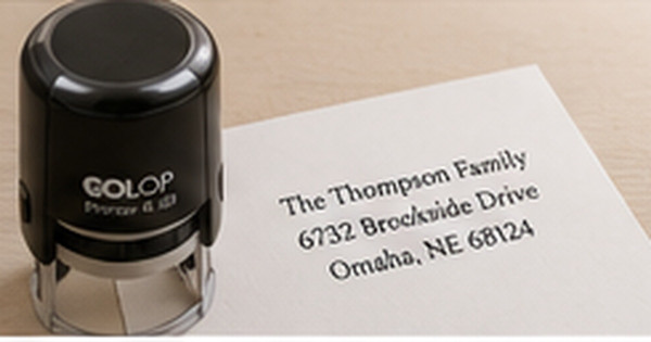
Round Address Stamps: Design Rules for a Clean Circular Impression
Posted by Affordable Address Labels on Oct 7th 2023
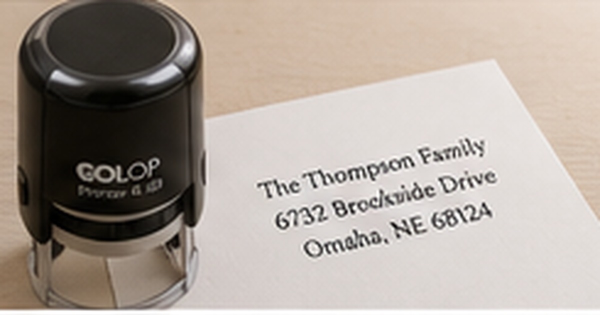
Round address stamps create a natural frame for a monogram, family name, small icon, or business mark. The circular shape feels complete on envelopes and tags, but it also limits usable space near the top and bottom of the impression.
A successful round stamp is not simply a rectangular address bent into a circle. The information needs a hierarchy designed for the shape, with enough diameter, line weight, and open space to stamp cleanly.
Decide what belongs in the center and around the edge
Many circular stamps place an initial, surname, or small icon in the center, with the address following the outer ring. Others keep the full address centered and use a border only as a frame. Choose one structure before selecting fonts.
Curved text is best for short, predictable information. Long street names and city lines can become cramped around the perimeter. When the address is lengthy, a centered multi-line layout inside a circle may be more readable.
Choose a diameter based on the longest information
Measure the envelopes or tags where the stamp will be used. A small circle can suit gift tags and compact note cards, while a larger diameter gives curved addresses and decorative borders room to breathe.
Print the proposed circle at actual size and place it on the smallest common envelope. The diameter should feel intentional without touching seams, edges, or neighboring design elements.
Use sturdy lines and controlled typography
Fine wreaths, tiny dots, and thin scripts may disappear or fill in with ink. Simplify artwork and use line weights appropriate to the production method. The center monogram can be decorative, while the address should remain straightforward.
Keep letter spacing generous around curves. Characters that are too close can merge, especially at the bottom of the circle where orientation and spacing become harder to read.
Practice pressure and alignment on scrap paper
Round impressions make rotation more visible than rectangular ones. A small alignment mark on the housing or a consistent grip can help keep the design upright. Test several impressions before using the stamp on important envelopes.
Use a flat, smooth surface and even pressure. If one edge appears light, check the stamping surface and technique before adding ink. Refill only with the product recommended for the stamp mechanism.
Test rotation, pressure, and edge quality together
Make twenty impressions on scrap paper using the grip and speed expected during real use. Mark which impressions are upright, fully inked, and evenly pressured. If rotation varies, add a small orientation mark to the housing or establish a consistent thumb position before stamping important mail.
Then test the stamp near the edge and flap seam of the intended envelope. A circle can appear visually crooked even when only slightly rotated, and uneven paper thickness can weaken one side of the impression. Adjust placement rules or choose a flat label area so the finished circular design looks intentional every time.
Store one ideal impression with the stamp instructions and refill information. When the output begins to change, the reference helps distinguish normal wear from a pressure problem or low ink. It also gives another household member or employee a clear target when the stamp is shared.
Consider how the circle relates to the envelope shape. A centered round mark can feel formal, while a smaller circle placed near a corner can feel modern and casual. Placement should be tested with postage and recipient addressing visible.
Quick checklist
- Choose center-versus-ring information hierarchy
- Measure the smallest intended envelope
- Print the diameter at actual size
- Simplify fine lines and artwork
- Use readable spacing around curves
- Practice upright alignment and even pressure
Frequently asked questions
What information works best around the outer circle?
Short names, city/state, or a concise address can work. Long streets and extra lines may be better centered inside the circle.
Can a round stamp include a logo?
Yes, especially a simplified icon or monogram. Detailed logos may need a larger diameter or reduced artwork.
Why does part of the circle print lightly?
Uneven pressure, a soft or uneven surface, low ink, or very fine artwork can cause incomplete impressions. Test technique before re-inking.
Design for the circle from the beginning
Round stamps look polished when the information, diameter, and line weight are built for the shape. Compare personalized round address stamps and keep address labels available for dark, glossy, or uneven surfaces.