
Return Address Labels with a Personal Touch: Design Ideas That Feel Like You
Posted by Affordable Address Labels on Nov 4th 2018
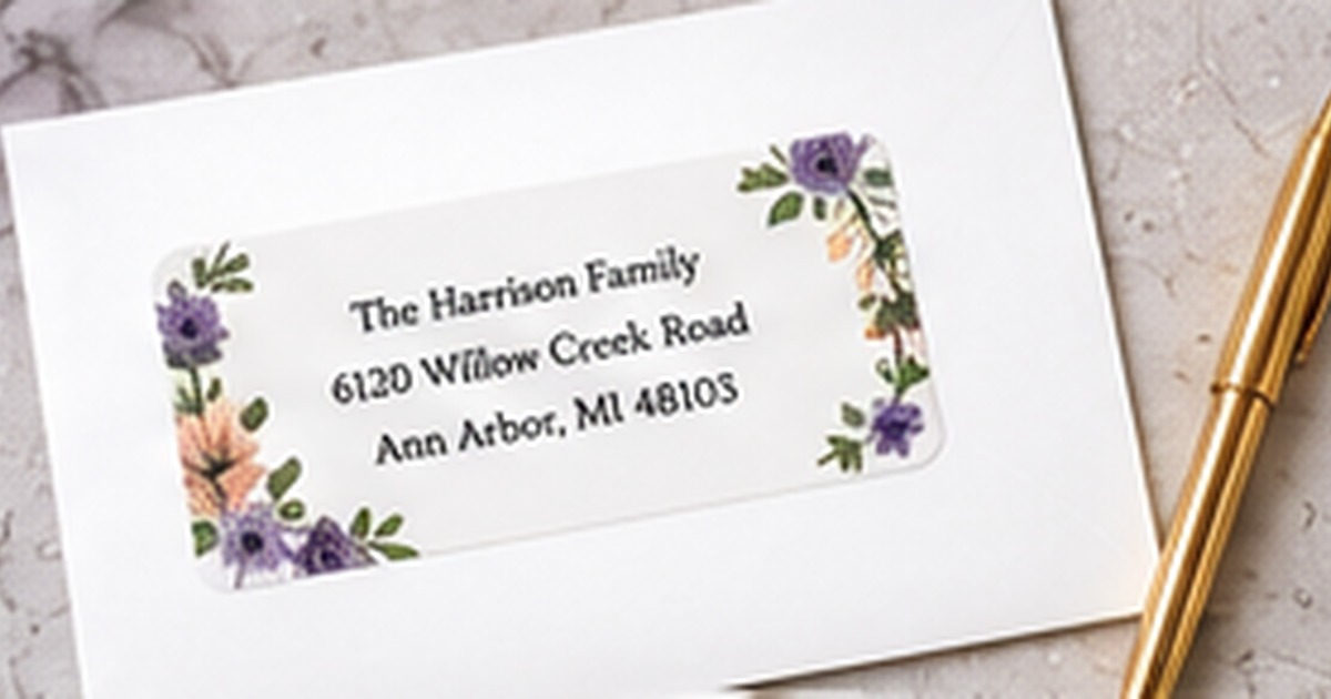
A return address label is a small piece of stationery, but it can communicate warmth, style, and household identity before the envelope is opened. Personalization works best when it supports the address instead of competing with it.
The most useful designs combine a recognizable personal detail with clear typography, balanced spacing, and colors that work across many envelopes. The following steps focus on real use, clear communication, and a result that can be maintained instead of looking good only on the day it is created.
Choose one personal element
Begin with one meaningful feature such as a flower, pet silhouette, monogram, hobby icon, or regional motif. This is the foundation of this part of the system because it keeps the purpose clear before design or quantity decisions are made. Next, avoid combining several unrelated symbols in a small space. Next, let the chosen element establish the mood while the address remains the focal point. Next, select an image style that fits the household rather than a temporary trend. This approach works because it makes the next action obvious and removes the need to reinterpret the system each time.
Use names in a way that feels natural
A useful starting point is to choose a family-name format, individual names, or a neutral household line based on how the mail is actually sent. That choice creates a clear rule that can be repeated across the entire project. Next, consider blended families and different surnames before forcing a traditional formula. Next, keep the name line short enough to balance with the address. Next, proof punctuation and apostrophes carefully because they are visually prominent. Before ordering or applying the full quantity, test one real example under the same conditions in which it will be used.
Build a versatile color palette
The most dependable method is to use one main color and one accent rather than a large rainbow. It reduces exceptions and makes the finished result easier to understand at a glance. Next, test the label on white, cream, kraft, and darker envelopes. Next, keep essential text dark enough for postal handling. Next, choose seasonal colors only when the labels are intended for a limited mailing period. Consistency matters more than complexity: a modest system followed every time is more useful than an elaborate one that people avoid.
Match the font to the personality and address length
Begin by planning to pair a decorative name font with a simple address font when readability is important. Once that decision is settled, the remaining design and organization choices become much easier. Next, avoid thin scripts for very small labels. Next, use wider layouts for long street names and city lines. Next, print the proof at actual size before approving it. The final check should be practical rather than purely visual, including readability, placement, durability, and ease of replacement.
Make the design practical for repeat use
For this step, it helps to order a quantity that matches real mailing habits. The goal is a repeatable result, not a one-time arrangement that is difficult to maintain. Next, save the product details and proof for easy reordering. Next, store labels flat with envelopes and stamps. Next, review the address after a move, name change, or postal-format update. Document the decision in a saved proof, sample, or short note so future reorders and updates do not start from zero.
Quick checklist
- Begin with one meaningful feature such as a flower, pet silhouette, monogram, hobby icon, or regional motif
- Choose a family-name format, individual names, or a neutral household line based on how the mail is actually sent
- Use one main color and one accent rather than a large rainbow
- Pair a decorative name font with a simple address font when readability is important
- Order a quantity that matches real mailing habits
Frequently asked questions
Can a personal label still look professional?
Yes. A restrained icon, strong spacing, and readable type can feel personal without looking informal.
Should every family member be listed?
Only if that wording fits the household and remains readable. A family name or household line is often more flexible.
What is the easiest way to personalize a simple label?
A monogram, small botanical accent, or distinctive color is enough to make a basic layout feel custom.
Put the plan into practice
A clear system makes the project easier to complete and easier to repeat. Review one full-size sample, correct any wording or spacing issues, and keep the final details for future use. Explore personalized address labels to coordinate the practical pieces with the look you want.