
Pet-Themed Stationery: Add Personality Without Making Mail Look Childish
Posted by Affordable Address Labels on Sep 29th 2021
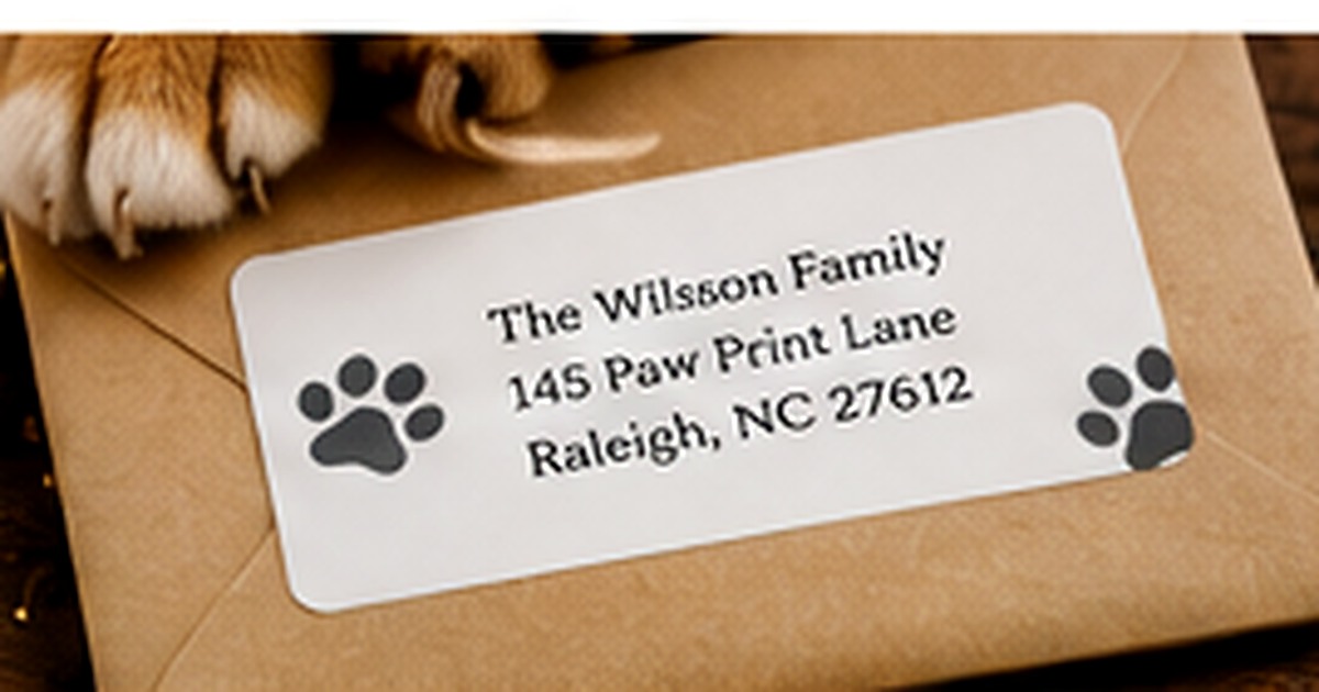
Pet-themed stationery can be playful without looking like novelty paper. A small paw print, silhouette, or carefully chosen color can acknowledge an important member of the household while the address and message remain polished.
The difference is restraint. When the pet motif acts as an accent rather than the entire design, the stationery can work for everyday notes, holiday cards, gifts, and casual professional correspondence.
Choose a motif with a simple visual shape
Paw prints, line silhouettes, collars, or a small profile illustration reproduce well at label size. Detailed portraits can lose clarity when reduced, so save those for larger cards or prints. A simple motif is also easier to repeat across return labels, note cards, and envelope seals without making the set feel crowded.
Use mature color combinations
A pet theme does not require bright primary colors. Navy and cream, charcoal and blush, forest green and kraft, or black and white can feel sophisticated. If the stationery is mainly for children or camp mail, brighter colors may be appropriate. Match the palette to the person using the stationery rather than assuming every pet design should look the same.
Keep the household information accurate and flexible
Decide whether the label should use a family name, individual names, or a neutral household line. Including the pet’s name can be charming on personal notes, but it reduces flexibility if the label is also used for businesslike correspondence. Many households let the graphic represent the pet while keeping the written information focused on the sender and address.
Coordinate cards and labels without repeating everything
A card might feature a larger pet illustration while the label uses only a paw-print accent. This creates a clear family resemblance between the pieces without duplication. Keep fonts and one key color consistent. The result feels intentionally coordinated and leaves enough space for the handwritten message to remain the most personal part.
Proof the design at actual label size
Pet art often looks charming when enlarged on a screen but can become muddy when printed small. Check line weight, contrast, and the space around the address. Make sure ears, paws, or whiskers do not merge into the type. A full-size paper proof reveals whether the design is polished or too detailed.
A polished pet-stationery example
A cream rectangular label might use a charcoal family address with one small line-drawn paw in the corner. Matching note cards could carry a larger silhouette on the back, while holiday envelopes add a temporary deep-green accent. The household identity stays consistent and the pet reference feels intentional. Because the motif is simple, the set works for thank-you notes and family correspondence rather than only pet-related messages.
Common pet-design mistakes
Avoid combining several animal silhouettes, paw borders, bones, and playful type in one small label. Do not assume a childlike color palette is the only option. If a pet’s name is included, verify spelling and consider whether the label will still feel appropriate on more formal mail. Detailed photographs are usually better on cards than on tiny address labels, where they can lose clarity.
Do one real-world review before finalizing
Before committing to the final approach, create one complete sample using the actual materials, names, address details, containers, or stationery involved in pet themed stationery. View it in normal light, handle it the way a recipient or household member would, and ask another person what they notice first. This last review catches small problems with scale, wording, placement, and usability. Record the approved choices so a future reorder or update begins from a tested version rather than an old draft or memory.
Quick checklist
- Choose one simple pet motif
- Use a color palette that matches the user
- Let the graphic represent the pet when names reduce flexibility
- Review the design at actual size
Frequently asked questions
Can pet-themed stationery be used for holiday mail?
Yes. A subtle pet motif can pair easily with seasonal colors or cards without looking overly casual.
Should the pet’s name appear on the return label?
It is optional. Including the name is personal, while omitting it makes the label more versatile.
What if the household has several pets?
Use one general motif such as paw prints or a simple household phrase instead of trying to fit multiple detailed portraits.
Put the plan into practice
A thoughtful system is easier to use when the design and supplies support the real task. Explore personalized address labels and greeting cards to create coordinated pieces that remain clear, practical, and personal.