
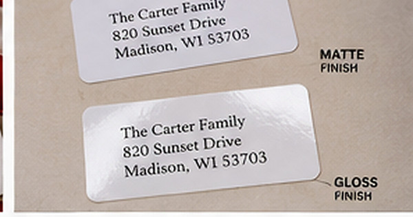
Paper Finish Guide: Matte, Gloss, and Uncoated Address Labels
Posted by Affordable Address Labels on Mar 30th 2020
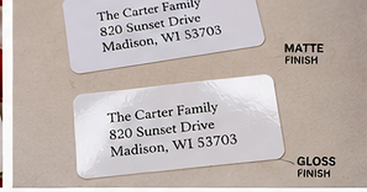
Paper finish changes how an address label looks, feels, and performs. The same design can appear soft and understated on matte stock, bright and polished on gloss, or tactile and traditional on uncoated paper.
There is no universally best finish. The right choice depends on the envelope, printing style, handling conditions, and whether anyone needs to write on the label after printing.
Matte: low glare and versatile
Matte labels reduce reflection and tend to suit modern, rustic, floral, and understated designs. Text remains easy to see under varied lighting, which is helpful for small address lines. Matte surfaces also photograph well when packaging is shared on social media.
Some matte coatings accept pen better than gloss, but not all are equally writable. Test the exact product if you plan to add dates, initials, or short notes.
Gloss: saturated color and a polished surface
Gloss can make photographs, bright colors, and dark backgrounds appear more vivid. The smooth finish often feels finished and durable, especially on product packaging or promotional mail.
Glare may reduce readability at certain angles, and many pens smear on glossy surfaces. Keep postal text high contrast and avoid planning handwritten additions unless a compatible permanent pen has been tested.
Uncoated: natural feel and easy writing
Uncoated paper has a familiar stationery texture and usually accepts handwriting well. It pairs naturally with letterpress-inspired, vintage, kraft, and traditional designs. Ink may absorb slightly more, creating a softer appearance.
Fine lines and tiny text need careful proofing because absorbent stocks can reduce crispness. A medium-weight typeface often reproduces more reliably than delicate hairlines.
Match the finish to the use
Everyday personal mail often benefits from matte or uncoated labels because they are readable and easy to coordinate. Gloss may be a stronger fit for colorful branding, product packaging, or designs built around photography.
Consider the envelope surface too. A high-gloss label on a textured cotton envelope creates intentional contrast; on a shiny coated mailer, it may blend in and become difficult to see. Order a sample when the combination is unfamiliar.
Quick finish comparison
- Matte: low glare, versatile, generally easy to read
- Gloss: vivid color, polished appearance, less pen-friendly
- Uncoated: tactile, traditional, highly writable
- Always test adhesion on the target envelope
- Proof small type on the chosen material
Review the design in the context where it will be used
Place a printed sample of the matte vs gloss address labels on the actual envelope, card, container, or package. Scale, color, and spacing can feel very different on a real object than they do in an enlarged online preview. The surrounding materials should support the design rather than compete with it.
Read every personalized line aloud and compare the address against a trusted source. Check names, abbreviations, apartment numbers, ZIP codes, and punctuation. When two people share the proofing task, one can read the original information while the other checks the final design line by line.
Finally, decide how the item will be stored and reordered. Save the design name, product number, quantity, and order date. That information turns a successful first purchase into a dependable part of the household stationery routine.
Common mistakes to avoid
- Choosing style before confirming the wording
- Reducing type until a long line barely fits
- Using too many fonts or decorative elements
- Ignoring the color of the final envelope or surface
- Ordering a large quantity before testing one sample
A careful proof and a small real-world test prevent most of these problems. Make the design attractive, but let accuracy, readability, and ease of use guide the final decision.
Frequently asked questions
Which finish is easiest to write on?
Uncoated is usually easiest, followed by many matte stocks. Gloss typically requires a compatible permanent pen.
Does gloss make a label waterproof?
No. Gloss appearance does not automatically mean waterproof construction or adhesive.
Which finish is best for dark colors?
Gloss can increase saturation, while matte can produce a sophisticated soft look. Review a physical sample when color accuracy is important.
Can matte labels be used on packages?
Yes, provided the material and adhesive are appropriate for the package surface and expected handling.
Build a stationery system that fits real life
The best personalized paper goods are the ones you reach for often. Choose clear, accurate designs, store them where correspondence happens, and reorder before a holiday or event creates a rush. Explore personalized address labels, rubber stamps, and greeting cards to create a practical set for home, celebrations, or business mail.