
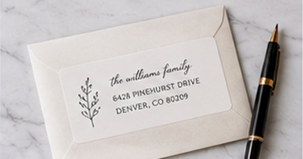
Minimalist Address Label Designs: How to Keep Them Simple and Distinctive
Posted by Affordable Address Labels on Apr 12th 2026
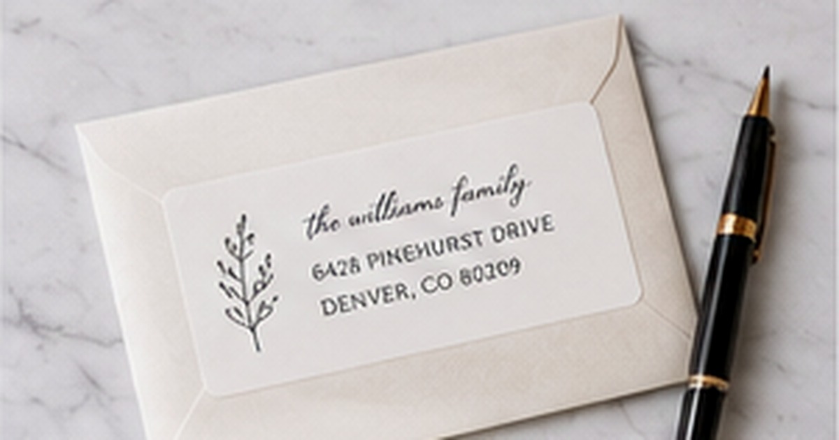
Minimalist address labels look effortless because the editing has already happened. Every line, font, border, and color earns its place. The result is calm, readable, and versatile enough to work on personal notes, professional correspondence, and seasonal cards.
Simple does not have to mean generic. Distinction can come from spacing, proportion, a carefully chosen typeface, or one small mark rather than a large collection of decorations.
Begin with the exact wording
Minimal layouts expose every inconsistency. Decide whether to use a household name, two full names, one surname, initials, or no name at all. Standardize abbreviations and punctuation before choosing the design.
Long names and addresses may require a wider label, smaller type, or an additional line. Do not reduce the design until the letters barely fit. A minimalist label needs visible breathing room to feel intentional.
Create hierarchy with size and weight
One typeface can do most of the work. Use a medium or bold weight for the name, regular weight for the street, and slightly smaller type for city/state/ZIP. The difference should be clear without becoming dramatic.
Center alignment feels formal and balanced; left alignment feels direct and modern. Whichever arrangement is chosen, keep line spacing consistent and avoid squeezing a decorative icon into the remaining gap.
Use one restrained point of personality
A thin border, tiny botanical line, monogram, house number, muted accent color, or unusual but readable name typeface can make the design memorable. Choose one. When several subtle elements are combined, the label may stop feeling minimal.
Neutral does not have to mean black and white. Deep navy, forest green, clay, warm gray, and burgundy can act as quiet signature colors while remaining readable across multiple seasons.
Evaluate the label as part of the envelope
Minimalism depends on context. A small white label may look refined on a textured navy envelope and unfinished on a large white mailer. Consider scale, edge spacing, envelope flap, postage, and any card artwork before finalizing the label.
Print a full-size sample and view it from arm's length. If the name and address are immediately clear and the label does not compete with the envelope, the design is doing enough.
Evaluate the finished label in real use
Before committing to a large reorder, place the label on several envelopes and view it at normal reading distance. Check the longest address, the darkest envelope, and the occasion where the design will be used most often. A full-size test catches spacing and contrast problems that an enlarged preview can hide.
Store the approved design name, quantity, and order date with a photo of the finished envelope. That record makes later reorders faster and helps the household decide whether the same design still fits after a move, name change, new season, or shift in mailing habits.
Compare two versions instead of endlessly editing one
Create one proof that is extremely restrained and a second that adds a single point of personality. Put both on the same envelope, cover one at a time, and ask which version makes the address easier to recognize. Side-by-side comparison is more useful than making tiny changes without a clear reference.
Also test the label on an ordinary bill-sized envelope, not only a styled photograph. Minimal design earns its value through repeated use. If the quiet version still feels complete on plain mail and does not depend on props or special lighting, it is likely to remain useful for a larger order.
Quick checklist
- Finalize the exact wording first
- Use one type family when possible
- Create hierarchy with size and weight
- Choose one small distinctive detail
- Keep generous internal spacing
- Test the label on several envelope colors
Frequently asked questions
Are minimalist labels always modern?
No. A classic serif, centered layout, and thin border can feel traditional while remaining minimal.
Should minimalist labels have no graphics?
Not necessarily. One small line-art motif or monogram can provide identity without crowding the address.
What is the best color for a simple label?
A dark neutral or muted signature color with strong contrast is the most versatile. The envelope color should guide the final decision.
Use less, but make every choice deliberate
Minimalist labels succeed when wording, type, spacing, and material work as one system. Explore clean personalized address labels and pair them with a simple address stamp or understated greeting cards for a cohesive stationery set.