
Luxury Address Labels: Paper, Type, and Finishes That Look Premium
Posted by Affordable Address Labels on Sep 14th 2022
Luxury Address Labels: Paper, Type, and Finishes That Look Premium is most useful when the decision begins with real needs rather than decoration alone. This guide is written for customers preparing formal invitations, premium personal stationery, executive mail, or refined gifts. The goal is to create something that looks intentional, works reliably, and remains easy to use after the excitement of choosing a design has passed.
In this situation, the label or stamp may be used for wedding mail, anniversary notes, formal thank-you cards, executive correspondence, and high-end gift packaging. That variety makes planning important. A product can be attractive in a preview and still disappoint if the type is too small, the material does not suit the surface, or the wording becomes outdated too quickly.
Start with the real job the label must do
The first decision is practical: look elevated while preserving postal readability and avoiding fragile details that disappear at small scale. Write down the exact information that must appear and identify the people who will use or read it. That small step prevents a decorative idea from taking space needed for names, addresses, instructions, or required product details. It also helps determine quantity. A household mailing twenty cards has different needs from a business applying labels every day. Build the order around the real frequency and the highest-priority task.
Build the design around readability
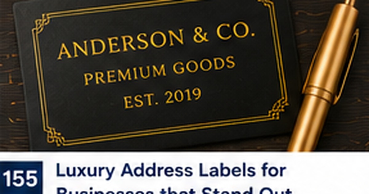
For the visual direction, consider generous spacing, one refined type family, deep neutral color, and a subtle monogram or metallic-style accent. Readability depends on contrast, spacing, and line length more than on font size alone. Keep the most important information visually dominant and use artwork as an accent. A useful proof should be viewed at actual size, not only enlarged on a screen. If the design must work on several envelope or package colors, check the lowest-contrast combination before approving the full set.
Choose materials for the actual surface
Material choice should follow use, not trend. In this case, smooth matte or softly lustrous stock often feels more refined than high-gloss material and supports crisp fine type. Consider texture, moisture, heat, handling, storage, and whether the item must be removable later. Adhesive products also need a clean, flat area large enough for full contact. When possible, test the material on the real envelope, jar, bin, or box. A small sample can reveal lifting corners, show-through, slow-drying ink, or unexpected surface texture.
Create a repeatable workflow
A practical workflow is to begin with typography and spacing, add one premium accent, and proof the design at actual size before choosing quantities. Keep the approved wording, image filename, order date, and reorder details in one place. For a business or shared household system, document where the label is applied and who updates the information. Repetition should make the process faster, not create more decisions. A well-planned system turns labels into a dependable tool instead of another collection of supplies that must be sorted every time.
Avoid the most common failure point
The most common problem is equating luxury with more decoration, more fonts, or very small script that sacrifices clarity. This usually happens when the preview is treated as the finished experience. Think through the full path: storage, application, mailing or delivery, handling, and eventual replacement. Limit the number of fonts, colors, and messages competing in a small area. When information changes, retire the old version promptly so outdated pieces do not remain mixed into active supplies.
Test before placing a larger order
Before committing, compare the proof beside the actual envelope and invitation under both daylight and warm indoor lighting. Ask another person to read the most important line without explanation. If the item supports a workflow, let that person complete the task using only the label or stamp. Testing exposes assumptions that the designer no longer notices. Once the sample passes, save it as the reference standard for future reorders so small changes do not gradually reduce consistency.
Practical checklist
- Confirm the exact wording and longest line before designing
- Check contrast and spacing at actual printed size
- Match the material to the real surface and conditions
- Order a quantity based on realistic use rather than guesswork
- Save the approved proof and reorder information
Frequently asked questions
How much decoration is appropriate?
Use enough design to communicate the intended style, but keep the primary information easy to find. One motif, one accent color, and one supporting type style are often sufficient.
Should I order the largest quantity for the best unit price?
Only when the wording, address, product, or workflow is stable. A smaller first order is often less expensive than discarding a large supply that becomes outdated.
What should I review before reordering?
Confirm names, addresses, phone numbers, product details, and placement. Also check whether the original size, material, and quantity matched real use.
Make the finished piece work as well as it looks
Good personalization is both attractive and functional. Start with the exact job, protect readability, test the real material, and keep the process repeatable. Explore personalized address labels, address stamps, and greeting cards to build a coordinated solution for your next mailing or organization project.