
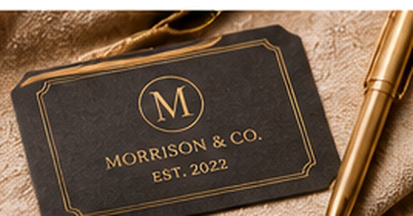
Luxury Address Labels: Paper, Foil, Typography, and Restraint
Posted by Affordable Address Labels on Mar 18th 2023
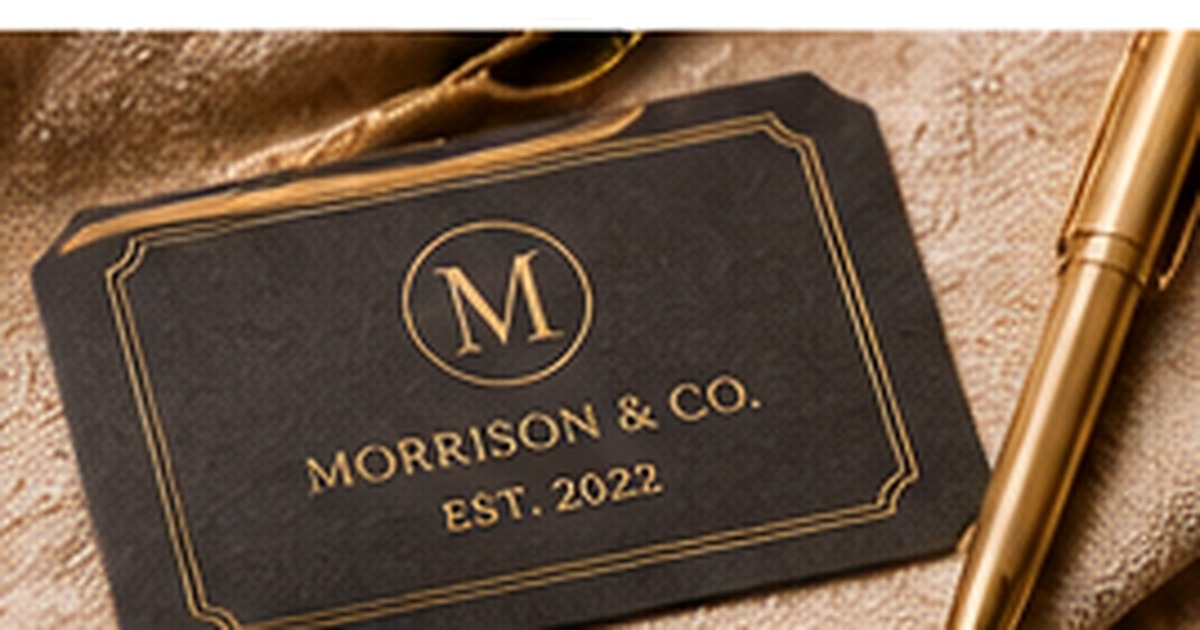
Luxury stationery is defined less by the number of decorative elements than by the quality and control of each choice. A strong address label may use beautiful paper, precise type, and one metallic accent while leaving generous space around the information.
The most common mistake is trying to make every detail look premium at once. Restraint creates hierarchy and allows materials and craftsmanship to be noticed.
Begin with a refined material and finish
Smooth matte paper, subtle texture, deep color, or a carefully selected clear stock can establish a premium tone before any artwork is added. Match the finish to the envelope. A textured ivory label may complement cotton paper, while a crisp black label can create contrast on a pale envelope. Test adhesion and appearance on the actual stationery because expensive-looking materials still need to function reliably.
Use foil as an accent, not a substitute for hierarchy
Metallic foil can highlight a monogram, border, or small motif. When every line shines, the address becomes harder to read and the effect loses focus. Keep essential mailing information in a strong, legible color and use foil where it creates a deliberate moment. Gold, silver, copper, and rose tones should coordinate with the paper and event rather than being chosen in isolation.
Choose typography with disciplined spacing
A luxury label may pair a classic serif with a restrained script or use one beautifully proportioned typeface throughout. Letter spacing, line spacing, and alignment are as important as the font itself. Avoid extremely thin strokes that disappear at small size. The label should look balanced from a normal viewing distance and remain easy for postal handling.
Limit the visual vocabulary
Choose one frame, crest, monogram, or botanical detail instead of combining several. A single well-drawn element feels more intentional than a collection of premium cues. Empty space helps the label feel confident and gives the eye a place to rest. If the design seems plain on screen, view it at actual size; small luxury pieces often gain strength through simplicity.
Coordinate the entire mailing piece
A premium label cannot rescue an envelope that conflicts with it. Consider the label, envelope color, postage, card paper, and placement together. One cohesive combination will look more sophisticated than individually impressive pieces that compete. Make a complete sample before ordering the full set.
A refined luxury example
An ivory cotton envelope may pair with a soft-white label, a small black serif address, and a single gold-foil monogram above the name. The foil appears only once, the margins are generous, and the typography aligns with the card. Nothing is oversized, yet the material and spacing communicate quality. A complete sample allows the sender to confirm that the label, postage, and envelope feel balanced together.
Common luxury-design mistakes
Avoid combining foil, a crest, script, a border, dark paper, and multiple decorative colors in one small space. Thin metallic lettering may be difficult to read, and large monograms can make the address feel secondary. Premium materials also require practical testing: a beautiful label that lifts from textured paper or conflicts with postage is not a successful luxury choice.
Do one real-world review before finalizing
Before committing to the final approach, create one complete sample using the actual materials, names, address details, containers, or stationery involved in luxury address labels. View it in normal light, handle it the way a recipient or household member would, and ask another person what they notice first. This last review catches small problems with scale, wording, placement, and usability. Record the approved choices so a future reorder or update begins from a tested version rather than an old draft or memory.
Quick checklist
- Choose the material before adding decoration
- Use foil on one controlled feature
- Prioritize spacing and legibility
- Proof the label with the full envelope and card
Frequently asked questions
Do luxury labels need metallic foil?
No. Beautiful paper, refined type, and strong spacing can create a premium result without metallic effects.
Are dark labels difficult for mailing?
They work well when the printed information has strong contrast and the label adheres cleanly to the envelope.
Can a minimalist label feel luxurious?
Yes. Minimalism often emphasizes material quality and typography more effectively than dense decoration.
Put the plan into practice
A thoughtful system is easier to use when the design and supplies support the real task. Explore personalized address labels to create coordinated pieces that remain clear, practical, and personal.