
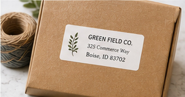
Kraft Paper Address Labels: When Rustic Style Works Best
Posted by Affordable Address Labels on Aug 17th 2019
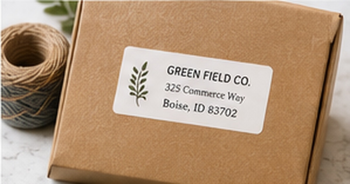
Kraft paper address labels create an immediate sense of warmth. Their natural brown tone pairs easily with twine, recycled-looking envelopes, handmade goods, farmhouse stationery, and understated packaging. The style can feel personal without becoming overly decorative.
Kraft is not the right answer for every envelope or every design, however. The paper color changes ink contrast, fine details can disappear, and the rustic look may conflict with glossy or highly formal materials. A successful kraft label balances texture with practical readability.
Use kraft where its natural character adds meaning
Kraft labels are especially effective for casual weddings, fall events, home-based businesses, garden products, baked goods, handmade gifts, and everyday mail with a relaxed aesthetic. The surface makes simple black typography and small botanical artwork feel intentional rather than plain.
The same label may look out of place on a bright white luxury envelope or a highly polished corporate package. Instead of treating kraft as a universal neutral, evaluate whether the recipient, occasion, and surrounding materials support the handmade visual language.
Design for a darker paper base
Black and very dark brown provide the most dependable contrast. Deep green, navy, and burgundy can also work when the type is large enough and the printing method produces solid coverage. Pale colors, thin gray lines, and delicate watercolor effects may become muddy against the brown stock.
Keep the address font straightforward. A decorative name line can add personality, but street, city, state, and ZIP should remain easy to scan. Borders should be slightly heavier than they would be on white paper because the kraft tone visually reduces fine line weight.
Match the adhesive and finish to the surface
A kraft look does not guarantee that every label has the same adhesive or finish. Smooth paper envelopes, corrugated boxes, glass jars, and coated mailers place different demands on the label. Confirm that the product is intended for the surface and temperature conditions where it will be used.
If the package may encounter moisture, test a finished label before relying on it for shipping. Natural-looking paper can absorb water or oils more visibly than a coated white label. For indoor gift packaging, that may not matter; for outdoor or refrigerated use, it can be decisive.
Avoid making the entire package too brown
Kraft paper, twine, a kraft envelope, and a kraft card can blend into one low-contrast field. Add visual separation with cream paper, dark ink, a white card, greenery, a colored ribbon, or one brighter accent. The goal is warmth, not visual sameness.
Order a sample or print a full-size mockup before committing to a large quantity. View the label in daylight and indoor light, then place it on the actual envelope or box. A rustic concept succeeds only when the address remains immediately clear.
Create a complete rustic package sample
Assemble one finished package with the exact kraft label, box or envelope, ribbon or twine, insert, and writing instrument planned for the project. View the package without styling props. If the address blends into the surrounding brown materials, add a cream card, darker type, or a more defined border rather than increasing the amount of decoration.
Leave the sample assembled for several days and handle it as a recipient would. Check whether corners lift, fibers show through the print, or twine rubs across the address. This small rehearsal is especially useful for businesses and events because the same combination will be repeated many times, magnifying any weakness in contrast or adhesion.
Quick checklist
- Use kraft for casual or natural brand styles
- Choose dark high-contrast typography
- Keep address lines simple
- Confirm adhesive for the final surface
- Test moisture exposure when relevant
- Add one contrasting material or color
Frequently asked questions
Are kraft labels made from recycled paper?
Some are, but the kraft appearance alone does not prove recycled content. Check the product specifications for material details.
Can kraft address labels be used on colored envelopes?
Yes, especially on cream, forest green, burgundy, navy, and white. Test the combination so the label does not disappear into a similar brown background.
Do metallic inks work on kraft paper?
They can, but coverage and shine vary by printing process. A printed proof or sample is the safest way to judge the effect.
Use kraft as a design choice, not a shortcut
Kraft paper labels work best when the natural surface supports the message and the address remains strong enough to read instantly. Browse personalized address labels for rustic options and pair them with simple stationery that adds contrast without losing warmth.