
Initials, Family Names, and Crests: Building a Balanced Monogram Label
Posted by Affordable Address Labels on Feb 10th 2024
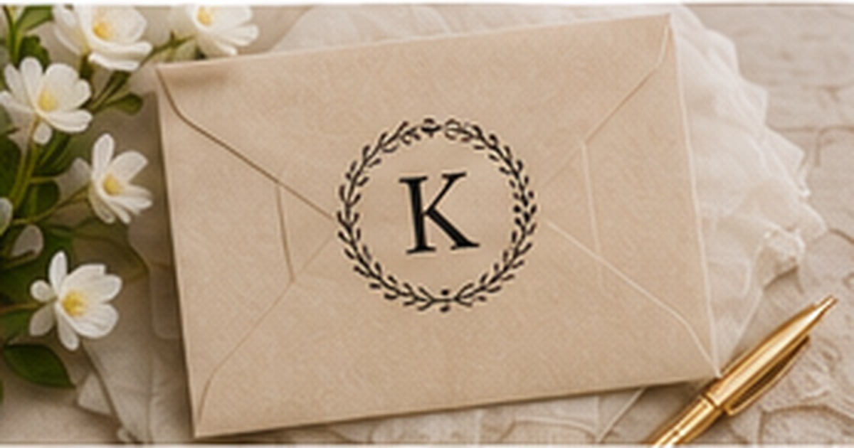
A monogram can make an address label recognizable with very little artwork. One letter, a pair of initials, or a small family crest creates a visual anchor that works across stationery, gifts, and household correspondence.
The difficulty is proportion. A large decorative initial can crowd the name, and a detailed wreath can make the address feel secondary. Balanced design gives the monogram enough presence to be memorable while preserving the information the label must deliver.
Choose the monogram structure before choosing a font
A single surname initial is the most flexible option for a household label. Two initials can represent partners, while a three-letter personal monogram may use first, middle, and last initials in a traditional arrangement. Confirm the intended letter order rather than assuming every template follows the same convention.
For shared household stationery, a family name or neutral household line may be clearer than combining several individual initials. The design should reflect how the mail is actually sent, not force a decorative rule onto a complex naming situation.
Give the crest enough room to breathe
Wreaths, shields, branches, and circular borders create a frame around the letter. Keep fine leaves and lines slightly heavier than they appear on screen so they reproduce cleanly at label size. Leave space between the artwork and nearby type.
If the monogram sits to the left, align the address block consistently. If it appears above the address, reduce its height so the label does not become unnecessarily tall. A symmetrical composition should still allow the ZIP code to remain easy to find.
Use contrast between display and practical type
A decorative serif or script can work for the initial or family name. Address lines should generally use a simpler companion font. This contrast creates hierarchy and prevents every line from competing for attention.
Limit the number of typefaces. One display face plus one readable text face is usually enough. Repeating a small shape or line weight from the crest in the border can create unity without adding another font or ornament.
Test the monogram across more than one occasion
Place the proof on a plain bill envelope, a holiday card, and a formal note. A monogram that feels elegant only in a styled product photograph may be too ornate for everyday use. The best designs remain complete even on simple paper.
Check the design with the longest family name and full address. If the monogram forces type below a comfortable size, simplify the crest or choose a larger label rather than compressing the practical information.
Compare the monogram at three viewing distances
Examine the proof close up for line quality, at arm’s length for readability, and from several feet away for overall balance. The monogram should remain recognizable from a distance while the address becomes clear as the viewer approaches. If the crest dominates from every distance, reduce its size or weight.
Print the design in black and white even when the final version uses color. A monochrome proof reveals whether structure and hierarchy are doing the work or whether the design depends on subtle color differences that may not reproduce consistently. A strong monogram label should remain balanced in either version.
Save both the final color file and a simple one-color version. The alternate artwork may be useful for stamps, embossers, invoices, or future stationery where the original palette is unavailable. Keeping the underlying monogram consistent across formats builds recognition without requiring every product to use identical materials.
Quick checklist
- Confirm the intended initial order
- Choose one household naming structure
- Keep crest lines printable at small size
- Pair display type with a readable address font
- Limit the design to two typefaces
- Test on everyday and formal envelopes
Frequently asked questions
What initial should a family monogram use?
A shared surname initial is common, but households can use two initials, a neutral symbol, or the written family name when that is more accurate.
Can a monogram include a date?
Yes, especially for weddings or anniversaries, but dated labels are less versatile and should be ordered in event-based quantities.
Are crests too formal for everyday mail?
Not when they are simple. A small wreath or line-art frame can feel approachable on ordinary envelopes.
Let the monogram identify the household without overpowering it
A balanced monogram gives the eye one memorable detail and leaves the address easy to read. Explore personalized monogram labels and coordinate the same initial or crest with stationery for a consistent household style.