
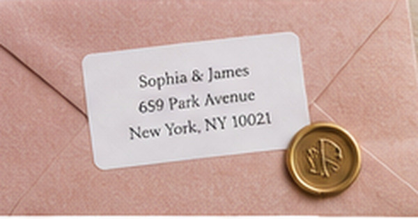
How to Use Script Fonts on Romantic Stationery Without Losing Readability
Posted by Affordable Address Labels on Feb 14th 2020
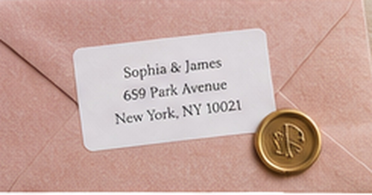
Script fonts bring movement and intimacy to wedding stationery, anniversary notes, love letters, and personalized labels. They can also become difficult to read when every line uses elaborate swashes, thin strokes, or tightly connected letters.
The goal is not to avoid script. It is to assign it the right job. A display font can carry emotion in the names or heading while a simpler companion font handles dates, addresses, and instructions.
Use script for emphasis, not every piece of information
Names, a short greeting, or a monogram are natural places for script because the reader expects a decorative element. Street addresses, RSVP instructions, dates, and venue information require faster recognition and usually benefit from serif or sans-serif type.
When script appears in several places, keep the same family and reduce extra swashes. Multiple decorative scripts can make a stationery suite feel inconsistent and visually noisy.
Judge the font at the final printed size
Many scripts look beautiful when enlarged and collapse when reduced. Thin upstrokes disappear, counters close, and similar letters become difficult to distinguish. Print a proof at 100 percent and ask someone unfamiliar with the text to read it.
Pay special attention to capital letters, repeated strokes, long surnames, and number forms. A romantic typeface that makes the address uncertain is not serving the occasion.
Create contrast through pairing and spacing
Pair an expressive script with a restrained serif or clean sans-serif. The companion font should not imitate the script’s personality; it should provide structure. Consistent alignment and generous line spacing make the decorative name feel intentional.
Avoid setting script in all capitals. Most script families are designed around connected lowercase forms, and uppercase words can become a series of disconnected flourishes. Use normal capitalization unless the specific typeface proves otherwise.
Control swashes, color, and background detail
Long swashes can collide with neighboring lines, envelope edges, or floral artwork. Use alternates selectively and inspect every letter combination. One elegant flourish often has more impact than several competing strokes.
Maintain strong contrast. Pale blush script on cream paper may be difficult to see, while deep burgundy, navy, charcoal, or black can preserve the romantic mood. Keep textured backgrounds and illustrations away from the most delicate letterforms.
Conduct a blind reading test
Print several names, dates, and addresses in the proposed script without telling the reader what the text says. Ask two people to read each line once at normal distance and mark any uncertain letters. Familiarity can hide problems because the designer already knows the intended words.
Pay special attention to pairs such as I and J, r and v, capital S and L, and decorative numerals. If readers pause, keep the script for a larger name line and move practical information into the companion font. Romantic design becomes more confident when the viewer does not have to decode it.
Test printing on the final paper because absorbency and texture can change fine strokes. A script that looks crisp on coated proof paper may spread on soft cotton stock or lose detail on textured envelopes. Adjust weight or size based on the real material rather than the cleanest available printer sample.
When addresses are being merged from a spreadsheet, test the script with the longest name and street in the list. Automated personalization can expose letter combinations and line lengths that were not visible in the original sample.
Quick checklist
- Reserve script for names or short phrases
- Use a readable companion font
- Print at final size
- Ask an unfamiliar reader to test it
- Limit swashes and decorative alternates
- Maintain strong color contrast
Frequently asked questions
Can script be used for a full address?
It can, but legibility must be tested carefully. Many designs use script only for the name and simpler type for the address lines.
How many fonts should a stationery suite use?
Two well-paired typefaces are usually sufficient: one display style and one practical text style.
Are thin scripts suitable for small labels?
Often not. Fine strokes can disappear or print unevenly at compact sizes, so choose a sturdier script or a larger format.
Let script provide emotion while simpler type provides clarity
Romantic stationery succeeds when beauty and reading work together. Use script selectively, proof it at final size, and pair it with dependable type. Coordinate personalized address labels with greeting and event stationery using the same controlled typography.