
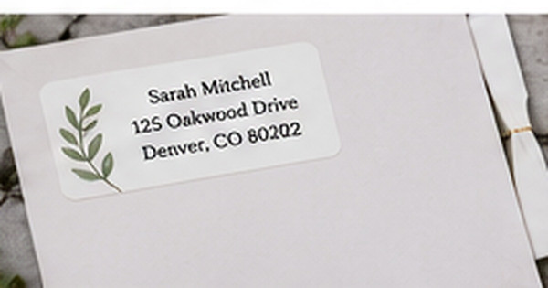
How to Proof a Return Address Label Before Ordering
Posted by Affordable Address Labels on Jul 14th 2022
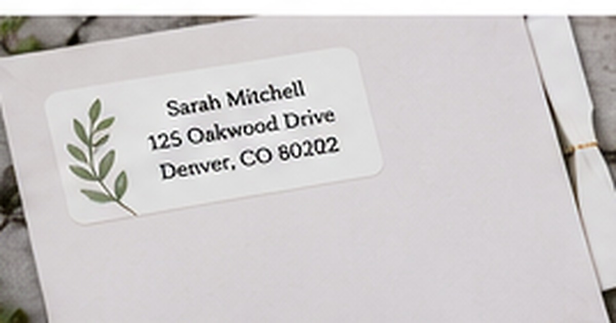
Most custom-label mistakes are easier to prevent than to fix. A misspelled street, missing apartment number, or font that looked large on screen can make an entire order frustrating to use.
A disciplined proof review takes only a few minutes. Check the information first, then the visual design, and finally the label at its true printed size on the envelope you plan to use.
Verify the address against an independent source
Do not proof only by rereading the text you originally typed. Compare it with an official postal record, recent bill, lease, or trusted account. Check house numbers, directional abbreviations, apartment or unit lines, city spelling, state abbreviation, and ZIP code. If the household recently moved, confirm that the new address is active and that everyone agrees on the exact name format.
Read every line aloud and backward
Reading aloud slows the eye and makes missing words easier to notice. For names and numbers, review individual elements from the bottom upward so familiarity does not hide an error. Ask another person to proof the label without telling them what to expect. A fresh reader is more likely to catch a transposed digit or repeated word.
Check type size and contrast at actual scale
Zoomed design previews can make small lettering look comfortable. Print or view the proof at the real label dimensions. The address should be readable without leaning close. Confirm that decorative script does not affect critical lines and that the text contrasts with the label background. If the label will go on a colored envelope, place the proof over a sample of that color.
Review spacing, alignment, and artwork
Look for crowded edges, awkward line breaks, and graphics that pull attention away from the address. Long family names and street lines may need slightly smaller type or a wider label. Make sure artwork does not touch text or appear accidentally cut off. A balanced label should look intentional from a normal viewing distance, not only under close inspection.
Test the label on the intended envelope
Cut a paper proof to size and place it where the real label will go. Check the flap, seams, postage area, and recipient-address space. This physical test reveals proportion problems immediately. Save the approved proof and order details once everything is correct so future reorders use the same verified version.
A five-minute proof routine
Print the label at exact size, cut it out, and place it on the smallest and darkest envelopes you expect to use. Read every line from several feet away, then compare the address with a trusted record. Ask another person to read the names and numbers without seeing your source. Finally, photograph the sample in ordinary light. The photo often reveals crowding or low contrast that the eye overlooks during close review.
Common proofing mistakes
Do not approve only from a zoomed phone screenshot or rely on spell-check for names and street numbers. Avoid reviewing the information and design simultaneously; verify facts first, then appearance. A label can be beautiful and still contain the wrong ZIP code. Save the final approved version with a clear file name so an earlier draft is not used for reordering.
Do one real-world review before finalizing
Before committing to the final approach, create one complete sample using the actual materials, names, address details, containers, or stationery involved in how to proof a return address label. View it in normal light, handle it the way a recipient or household member would, and ask another person what they notice first. This last review catches small problems with scale, wording, placement, and usability. Record the approved choices so a future reorder or update begins from a tested version rather than an old draft or memory.
Quick checklist
- Compare the address with an independent record
- Have another person proof names and numbers
- Review the design at actual printed size
- Place a paper proof on the real envelope
Frequently asked questions
Should punctuation appear in an address label?
Use a consistent format that remains easy to read. Postal-style addresses often use limited punctuation, while personal designs may include it.
How small is too small for label text?
If the address is uncomfortable to read at normal distance on an actual-size proof, increase the size or simplify the layout.
Can I approve a proof from my phone?
You can review information, but a printed or accurately scaled proof provides a better sense of final size and spacing.
Put the plan into practice
A thoughtful system is easier to use when the design and supplies support the real task. Explore personalized address labels to create coordinated pieces that remain clear, practical, and personal.