
How to Make Dark Envelopes Readable with White, Gold, or Clear Labels
Posted by Affordable Address Labels on Jul 29th 2023
Black, navy, burgundy, and forest-green envelopes create a dramatic first impression, but standard dark ink disappears on them. The address area needs a deliberate contrast solution that still looks integrated with the stationery.
White, cream, metallic, and clear labels can all work, but they produce different results. The best choice depends on the envelope texture, print color, and formality of the piece.
Use white or cream for the highest reliability
A light opaque label creates the strongest and most predictable reading surface. It works with postal scanning, handwritten recipient information, and small return text. The contrast can feel intentional when the label shape and border coordinate with the invitation or card.
Treat metallic details as accents
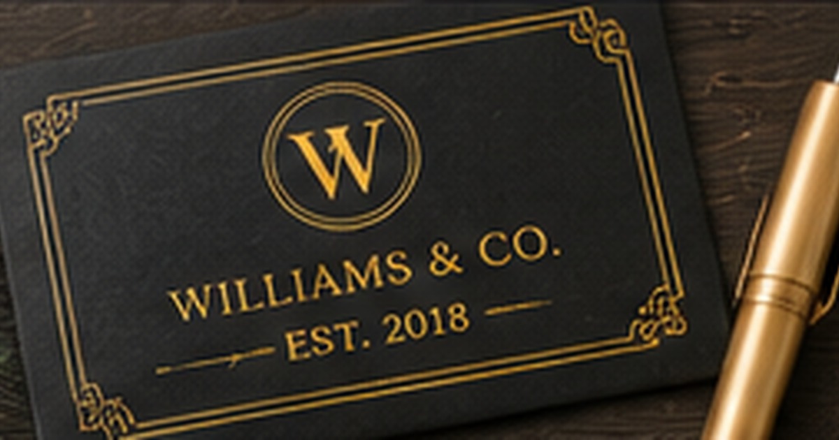
Gold or silver can make a label feel formal, but metallic lettering should not be the only element responsible for legibility. Reflection changes with light and angle. Use metallic borders, monograms, or icons around dark, readable text when the mailing information must remain clear.
Understand the limits of clear labels
A transparent label allows the envelope color to show through, which can look elegant on pale or medium surfaces. On very dark envelopes, standard dark print remains difficult to see. Clear stock works best when it supports a suitable light-print process or when the design includes an opaque area.
Test adhesion and texture
Some premium envelopes have cotton texture, coatings, or handmade fibers that affect adhesion. Apply a sample, wait overnight, and flex the envelope. Check whether corners lift and whether the label surface accepts any additional handwriting without smearing.
Decide what must remain consistent
Names, address formatting, font family, and core motif usually form the repeatable identity of labels for dark envelopes. Envelope color and seasonal accents can change around that core. Defining the stable elements prevents every mailing from becoming a new design project and helps reorders match earlier correspondence.
Use decoration to support recognition
Icons, florals, frames, and monograms should help the sender recognize the label without reducing the address area. Choose one main decorative idea and remove elements that repeat the same message. For how to make dark envelopes readable with white, gold, or clear labels, restraint often creates a more personal result because the chosen detail has room to be noticed.
Store the proof with reorder information
Keep the approved spelling, size, color, product reference, and order date in a stationery folder. A photograph of the label on a real envelope is useful as well. This record saves time later and prevents a successful design from being recreated slightly differently by accident.
Mistakes that make a good label less useful
Even a strong design for labels for dark envelopes can disappoint when the practical details are skipped. Avoid ordering from a sample address without testing the longest real line, shrinking type to preserve decoration, or choosing a material before checking the envelope or container surface. Do not assume the screen color will behave the same on kraft, dark, glossy, or textured paper. Check spelling and ZIP code from a reliable source, and make one full-size sample before approving quantity. Store the final proof and order details so how to make dark envelopes readable with white, gold, or clear labels can be reordered accurately. These small controls protect readability, reduce waste, and make the label dependable beyond the first attractive photograph.
Quick checklist
- Choose opaque light labels for dependable contrast
- Use metallic elements as accents
- Do not assume clear labels solve dark-background readability
- Test adhesion on textured premium stock
Frequently asked questions
Can I write on a white label after applying it?
Usually, but test the pen and label finish first to avoid smearing.
Do gold labels work for everyday mail?
They can, though they are most often chosen for formal events, holidays, or premium branding.
Will a clear label disappear on a black envelope?
The material may disappear, but dark printed text can disappear too. Contrast still has to be created intentionally.
Make the next mailing easier
A clear system turns the next envelope, package, or note into a repeatable task rather than a new design problem. Explore personalized address labels to coordinate the practical details with a polished finished look.