
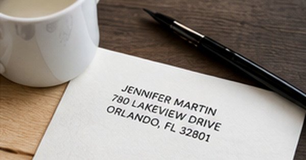
How to Create a Consistent Personal Brand Across Your Mail
Posted by Affordable Address Labels on Sep 5th 2021
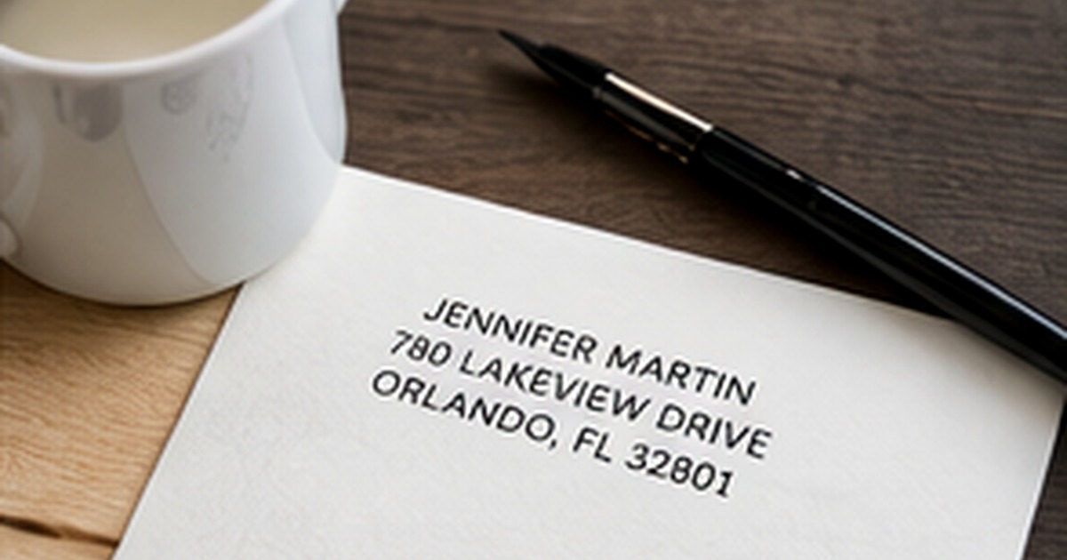
Personal branding is not limited to logos, websites, and social profiles. The way a note arrives—the envelope color, return address, paper, handwriting, and closing—creates an impression before the message is read. A consistent mail style can make personal correspondence feel more thoughtful and professional without becoming overly formal.
The objective is recognition, not repetition. A few recurring choices, used with flexibility, are enough to connect birthday cards, thank-you notes, invitations, and professional follow-ups into one coherent stationery wardrobe.
Define three traits before choosing design elements
Begin with words rather than fonts. Choose three traits that describe how you want your mail to feel: warm and modern, classic and understated, colorful and playful, calm and natural, or another combination that genuinely suits you. These traits become a filter for every later choice.
If a design looks attractive but contradicts the chosen traits, it probably will not earn regular use. A heavily ornate monogram may be beautiful yet feel wrong for someone whose everyday style is relaxed and minimal. Consistency becomes easier when the visual direction reflects real preferences.
Create a small repeatable design system
Select one primary type style for names, one supporting style for addresses or body text, and a compact color palette. You do not need exact matches across every product. Similar proportions, line weight, and tone can create a relationship even when the pieces come from different collections.
A botanical icon might appear on address labels, while cards use the same green and envelopes repeat the cream background. A monogram can anchor formal correspondence, with a simpler name treatment used for casual notes. Think in families of elements rather than identical templates.
Use consistency where recipients notice it most
The return address, envelope, and signature are the most repeated touchpoints. Keep name formatting consistent—such as always using first and last names, a household name, or initials. Use the same preferred street abbreviations and punctuation so the identity feels settled rather than improvised.
Handwriting does not have to be perfect. A dependable pen color, a simple closing, and a clear signature contribute as much to recognition as printed stationery. The human variation in a handwritten note keeps a coordinated system from feeling corporate.
Build enough flexibility for different occasions
A personal brand should not force a sympathy note and a birthday card to look identical. Keep one neutral foundation—perhaps a return address label and envelope style—then allow the card artwork and message to respond to the occasion.
Store the pieces together and record reorder details. When supplies are visible and easy to access, consistency happens naturally. When every card requires a new search for envelopes, stamps, and addresses, even a beautiful system becomes difficult to maintain.
Build a small sample set before expanding
Try the design on an everyday note, a formal card, and a seasonal envelope before ordering a large coordinated wardrobe. This shows whether the colors and typography are genuinely versatile or only look cohesive in a product preview.
Record which pieces are used first. The next purchase should follow real behavior: more everyday cards if those disappear quickly, fewer special envelopes if they remain untouched, and a refill of the label or stamp that consistently makes sending easier.
Quick checklist
- Choose three brand traits
- Select one primary and one supporting font style
- Use a small color palette
- Standardize how names and addresses are written
- Keep a neutral option for serious occasions
- Save reorder details and store the set together
Frequently asked questions
Do I need a personal logo?
No. Consistent type, color, spacing, and name formatting can create recognition without a formal logo.
Can personal and professional stationery overlap?
Yes, especially when the design is clean and the message is appropriate. Keep a separate business address or title when context requires it.
How many stationery designs are enough?
Many people can cover most needs with one everyday design, one formal option, and one seasonal or celebratory set.
Build recognition through small repeated choices
A consistent stationery style makes it easier to send mail and easier for recipients to recognize it. Start with a versatile set of personalized address labels, add a complementary address stamp, and keep a selection of greeting cards ready for the moments that deserve more than a quick message.