
How to Combine Red and Green in Holiday Mail Without Looking Generic
Posted by Affordable Address Labels on Jun 6th 2026
Red and green are instantly recognizable holiday colors, which is both their strength and their challenge. Used without restraint, the combination can feel busy or interchangeable with every seasonal design. Used with thoughtful shade, spacing, and material, it can feel classic and personal.
The goal is not to reinvent the palette. It is to decide which color leads, where the second color appears, and how neutral paper and dark type keep the address clear.
Choose specific shades rather than generic bright colors
Burgundy with evergreen feels traditional and refined. Cranberry with sage feels softer. Brick red with olive works well on kraft paper, while true red with deep forest green creates a more graphic classic look. Naming the shades helps the final design feel deliberate.
Avoid using equal amounts of two saturated colors in every element. Let one color dominate the envelope or artwork and use the other as a smaller accent.
Use neutral space to control the palette
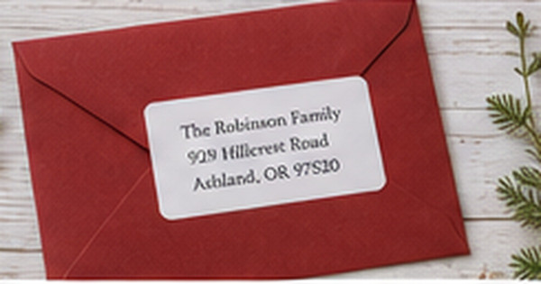
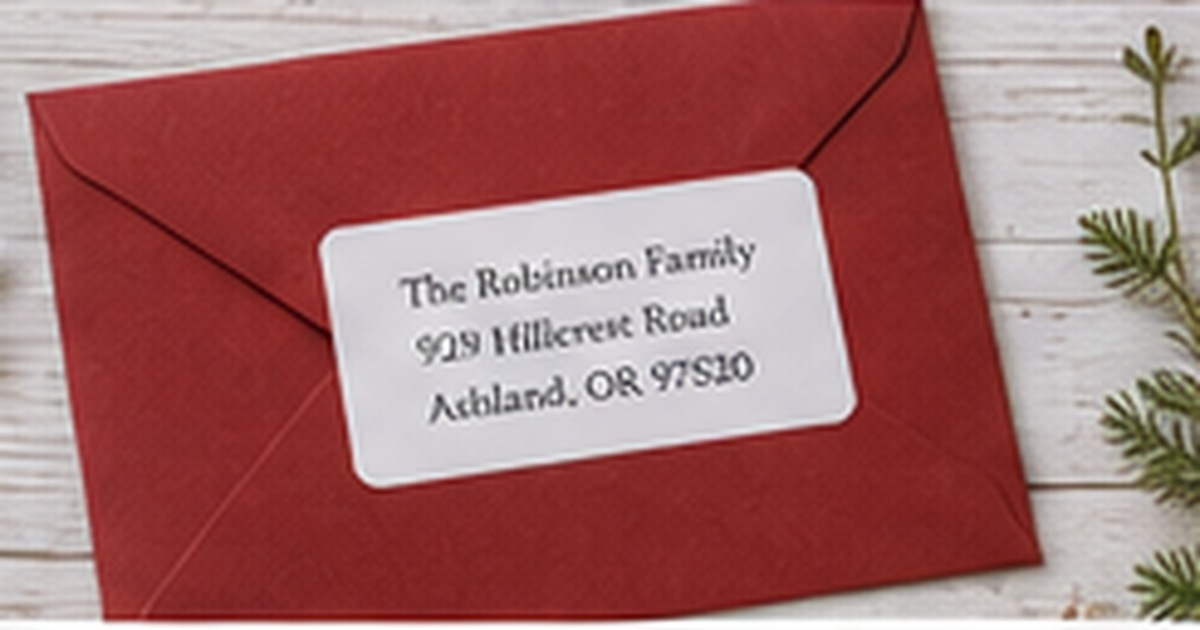
White, cream, kraft, charcoal, and warm gray give red and green room to breathe. A white matte label on a red envelope with one evergreen sprig may feel more polished than a label filled edge to edge with both colors.
Neutral type is often the safest choice. Black, charcoal, or deep navy can carry the address while red and green remain in the name, border, icon, or envelope.
Limit holiday motifs to one clear idea
Evergreen branches, berries, plaid, ornaments, a wreath, or a small tree can each support the palette. Combining all of them on a compact label makes the design harder to scan and more likely to feel generic.
Repeat one motif across the return label, card, or seal, but allow the scale and placement to change. Coordination does not require identical artwork on every piece.
Proof the complete mail piece under indoor light
Deep green and burgundy can print darker than expected. Place a real-size proof on the envelope and view it under the warm lighting common during the holiday season. Check that small lines and ZIP codes remain distinct.
If the design will be used on several envelope colors, test each one. A combination that looks balanced on cream may lose contrast on kraft or dark green.
Build three palette variations before choosing one
Create quick paper samples using the same layout with three shade combinations, such as burgundy and evergreen, cranberry and sage, and true red with forest green. Place each on the actual envelope and compare them without holiday props. The most balanced option should still look intentional on an ordinary desk.
Photograph the samples in daylight and warm evening light. Some greens turn nearly black indoors, while certain reds become brighter than expected. Select the combination that preserves the address and fits the card artwork in both conditions, then use the secondary color sparingly across seals, borders, or envelope liners.
Reserve a finished sample and note the exact color or product names used. Screens and memory are unreliable for shade matching a year later. The saved reference makes it easier to reorder a successful combination or deliberately choose a new one rather than ending up with several almost-matching reds and greens.
If the household uses photo cards, allow the photograph to lead. The return label should echo one color or motif instead of competing with the image, especially when the card already contains bright clothing, lights, or seasonal scenery.
Quick checklist
- Select specific red and green shades
- Let one color dominate
- Use white, cream, kraft, or gray as breathing room
- Keep the address in a dependable dark color
- Choose one main holiday motif
- Proof on every envelope color
Frequently asked questions
Can red text be used for the full address?
It can, but deep red often reads more clearly than bright red. Dark neutral text is generally the most dependable for small address lines.
How can the palette feel modern?
Use simplified artwork, generous white space, asymmetrical placement, and muted shades such as cranberry with sage.
Does the card need to match the label exactly?
No. Repeating one shade or motif creates enough connection. Exact matching can make the suite feel overly themed.
Keep the classic palette, refine the proportions
Red and green holiday mail feels distinctive when shade, scale, and neutral space are controlled. Browse holiday return address labels and coordinate them with seasonal greeting cards using one shared color or motif.