
Foil, Embossed, and Premium Address Labels: What Creates a Luxury Look
Posted by Affordable Address Labels on Nov 10th 2022
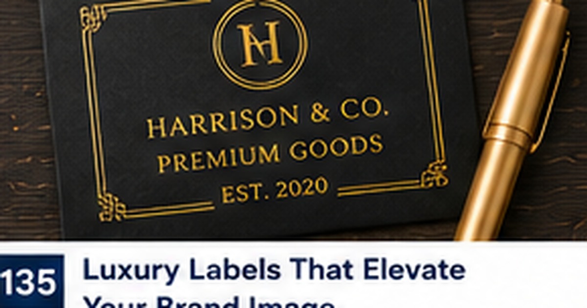
Luxury stationery is not created by adding the greatest number of decorative features. It comes from controlled materials, precise spacing, strong typography, and one or two details that feel intentional.
Address labels are small, so every element carries visual weight. Foil, embossing, dark stock, monograms, and ornate borders can look elegant, but they can also compete with the address if used without restraint.
Let typography establish the quality first
A premium label needs a strong type hierarchy before any special finish is added. Choose a readable address font and use decorative lettering sparingly for the household or brand name. Careful alignment, consistent line spacing, and balanced margins often create more perceived quality than an elaborate graphic.
For this part of the project, use a real sample instead of relying only on a screen preview. Check the wording, size, placement, and workflow with the people who will actually use it. A small test often reveals an issue before it affects an entire order or mailing.
Use foil as an accent, not the address itself
Metallic foil can add a refined border, monogram, or small motif. Essential address text should remain easy to read under different lighting. Highly reflective lettering may disappear at certain angles or scan poorly. Keeping foil separate from the core address preserves both elegance and function.
For this part of the project, use a real sample instead of relying only on a screen preview. Check the wording, size, placement, and workflow with the people who will actually use it. A small test often reveals an issue before it affects an entire order or mailing.
Understand embossed and printed effects
True embossing changes the paper surface, while printed shadows and highlights imitate depth visually. Both can be attractive, but they behave differently on adhesive stock. Ask what process is actually used and review a physical sample when texture matters. The label must still apply flat and remain legible on the envelope.
For this part of the project, use a real sample instead of relying only on a screen preview. Check the wording, size, placement, and workflow with the people who will actually use it. A small test often reveals an issue before it affects an entire order or mailing.
Pair dark stock with high contrast
Black, navy, burgundy, and deep green can create a premium appearance, especially with cream or metallic accents. However, dark labels need carefully chosen text and envelope combinations. Test whether the label looks integrated or like a separate block placed on the envelope. Contrast must remain strong enough for quick reading.
For this part of the project, use a real sample instead of relying only on a screen preview. Check the wording, size, placement, and workflow with the people who will actually use it. A small test often reveals an issue before it affects an entire order or mailing.
Keep the design useful beyond one event
If the label is expensive to produce, choose wording and styling that can serve more than one occasion. A timeless monogram or restrained border may work for invitations, holiday mail, and thank-you notes. Event dates and highly seasonal motifs can limit the useful life of leftover stock.
For this part of the project, use a real sample instead of relying only on a screen preview. Check the wording, size, placement, and workflow with the people who will actually use it. A small test often reveals an issue before it affects an entire order or mailing.
Quick checklist
- Perfect typography before adding finishes
- Use foil on accents
- Confirm the real production process
- Test dark stock on actual envelopes
- Choose timeless wording for costly labels
Frequently asked questions
Does foil make a label harder to read?
It can if the address itself is metallic. Use foil mainly for accents and keep essential text high contrast.
Are embossed adhesive labels practical?
They can be, but the material and production method must still allow flat, secure application.
Can a simple label look luxurious?
Yes. Excellent spacing, paper quality, and typography often look more premium than a crowded design.
Build a dependable stationery system
Good labels and paper goods make communication easier when the design supports the real task. Review personalized address labels to create a coordinated solution that is readable, useful, and appropriate for the occasion.