
Elegant Fonts That Elevate Your Stationery
Posted by Affordable Address Labels on May 21st 2025
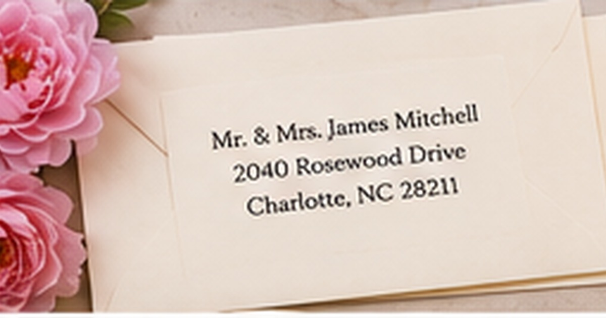
Typography determines whether stationery feels modern, romantic, traditional, playful, or professional. Elegant design is not simply a matter of choosing a script font; it comes from pairing type styles, spacing them carefully, and preserving readability.
Use decorative type selectively, let practical information remain clear, and proof every design at the size the recipient will actually see. The following steps focus on real use, clear communication, and a result that can be maintained instead of looking good only on the day it is created.
Understand the role of each font
Use one style for names or the main message. This is the foundation of this part of the system because it keeps the purpose clear before design or quantity decisions are made. Next, use a simpler companion font for addresses and details. Next, assign clear hierarchy before selecting ornament. Next, avoid adding a third font unless it serves a necessary function. This approach works because it makes the next action obvious and removes the need to reinterpret the system each time.
Choose scripts carefully
A useful starting point is to select scripts with open letterforms and visible spacing. That choice creates a clear rule that can be repeated across the entire project. Next, avoid extremely thin strokes on small labels. Next, check capital letters and common name combinations. Next, use script for short lines rather than full addresses. Before ordering or applying the full quantity, test one real example under the same conditions in which it will be used.
Use serif fonts for classic refinement
The most dependable method is to traditional serifs work well for invitations, monograms, and formal correspondence. It reduces exceptions and makes the finished result easier to understand at a glance. Next, compare high-contrast and softer old-style serifs. Next, increase size when fine strokes are delicate. Next, pair with generous margins. Consistency matters more than complexity: a modest system followed every time is more useful than an elaborate one that people avoid.
Use sans serif fonts for modern elegance
Begin by planning to clean sans serifs create a calm, contemporary look. Once that decision is settled, the remaining design and organization choices become much easier. Next, choose balanced proportions rather than novelty geometry. Next, use weight differences to create hierarchy. Next, combine with textured paper or a subtle motif for warmth. The final check should be practical rather than purely visual, including readability, placement, durability, and ease of replacement.
Proof spacing, punctuation, and scale
For this step, it helps to print the design at actual size. The goal is a repeatable result, not a one-time arrangement that is difficult to maintain. Next, check line spacing and alignment. Next, review initials, apostrophes, and long street names. Next, test the final color against the paper stock. Document the decision in a saved proof, sample, or short note so future reorders and updates do not start from zero.
Quick checklist
- Use one style for names or the main message
- Select scripts with open letterforms and visible spacing
- Traditional serifs work well for invitations, monograms, and formal correspondence
- Clean sans serifs create a calm, contemporary look
- Print the design at actual size
Frequently asked questions
What is the most readable font for an address?
A clear serif or sans serif with moderate stroke weight is usually the safest choice.
Can two script fonts be combined?
It is possible, but two decorative scripts often compete. One script paired with a simpler font is usually stronger.
Why does a font look different in print?
Size, paper texture, ink spread, and printing method can change how thin strokes and spacing appear.
Put the plan into practice
A clear system makes the project easier to complete and easier to repeat. Review one full-size sample, correct any wording or spacing issues, and keep the final details for future use. Explore greeting cards and personalized address labels to coordinate the practical pieces with the look you want.
A practical review before you finish
Set the completed piece beside the materials it will actually accompany and review it from the recipient’s point of view. Confirm that the main information is visible immediately, that decorative details do not interfere with reading, and that the design still works on the smallest or darkest item in the project. Check spelling, addresses, dates, and quantities against the source list rather than memory. Finally, prepare one complete sample from beginning to end. That sample often reveals placement, handling, or storage issues that are not obvious on a screen and gives everyone involved a reliable model to follow.