
Elegant Fonts for Classic Address Labels
Posted by Affordable Address Labels on Oct 30th 2018
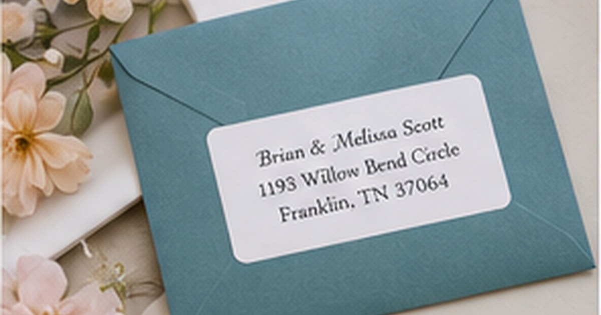
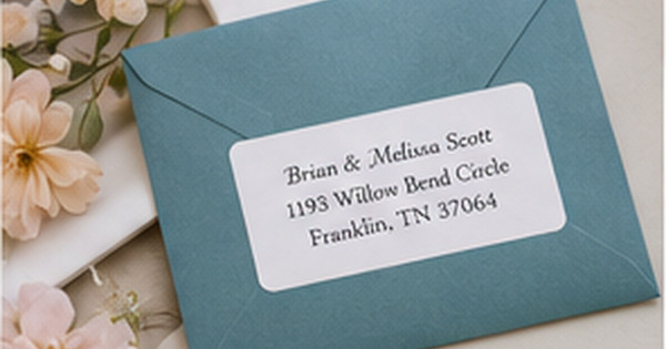
Elegant typography does not depend on elaborate flourishes. On a small address label, elegance usually comes from proportion, spacing, and restraint. The name feels distinct, the address is effortless to read, and the entire design looks settled on the envelope.
Choosing fonts by category—script, serif, sans serif—is only the beginning. The same font can appear refined or crowded depending on size, capitalization, line length, and the amount of white space around it.
Use serif type for structure and tradition
Serif fonts have small finishing strokes that can create a literary or formal tone. They work especially well for classic family names, traditional monograms, wedding correspondence, and understated business mail. A medium-weight serif often remains readable at small sizes better than a very thin high-contrast style.
All-capital serif text can look distinguished when letter spacing is generous, but it takes more horizontal room. Long surnames and street names may need mixed case or a slightly narrower style to avoid shrinking the entire label.
Reserve script for the part that deserves attention
Script introduces movement and personality, but not every script remains legible in a three-line postal address. Use it for the family name, first names, or a short greeting, then support it with a clear serif or sans serif for the address.
Look closely at capital letters and common combinations in the actual name. Some scripts have beautiful sample alphabets but confusing capitals, closed loops, or overlapping letters when typeset with a specific surname. The proof should be evaluated as a word, not as a font specimen.
Use hierarchy instead of multiple decorative fonts
A strong label can use one font family in different sizes and weights. The name may be larger, the street line medium, and the city/state/ZIP slightly smaller. This creates order without introducing another style.
If two fonts are used, give each a clear role. Combining a formal script, decorative serif, bold sans serif, and ornate monogram usually produces competition rather than sophistication. White space is part of the design and should not be treated as unused space that needs filling.
Match typography to the physical materials
A fine classic font may look crisp on smooth white stock and less defined on textured kraft paper. Dark envelopes, metallic finishes, and small label sizes all affect perceived weight. Choose a typeface that can tolerate the printing surface and viewing distance.
Place the final proof on the envelope and step back. The label should still communicate the name and address immediately. If the decorative qualities are visible only when the label is enlarged on screen, they may not contribute to the real object.
Evaluate the finished label in real use
Before committing to a large reorder, place the label on several envelopes and view it at normal reading distance. Check the longest address, the darkest envelope, and the occasion where the design will be used most often. A full-size test catches spacing and contrast problems that an enlarged preview can hide.
Store the approved design name, quantity, and order date with a photo of the finished envelope. That record makes later reorders faster and helps the household decide whether the same design still fits after a move, name change, new season, or shift in mailing habits.
Quick checklist
- Test the actual family name in the font
- Use script selectively
- Keep the address in a highly readable style
- Avoid more than two typefaces
- Check long lines before approving the size
- View the proof on the real envelope
Frequently asked questions
Is cursive always more elegant?
No. A well-spaced serif or restrained sans serif can look more elegant than a script that is crowded or difficult to read.
Can address lines be all caps?
Yes, if the font has enough spacing and the line length fits comfortably. Mixed case is often easier to scan in small sizes.
What font works for a very long last name?
A clean serif or sans serif with moderate width usually provides the most flexibility. Keep the name distinctive through size or weight rather than an extremely decorative style.
Let readability create the polished look
Classic address labels feel elegant when every choice supports the name and address. Select typography with the real wording, material, and envelope in mind. Browse personalized address labels and coordinate them with a traditional address stamp or timeless greeting cards.