
Colorful Address Labels That Make a Statement Without Sacrificing Readability
Posted by Affordable Address Labels on Jun 13th 2020
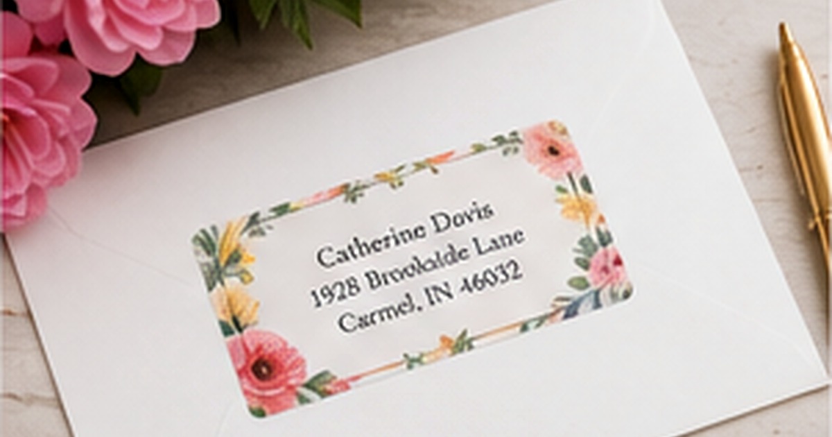
Colorful address labels can turn an ordinary envelope into something people notice before they open it. A floral border, saturated background, playful accent, or unexpected palette can communicate personality in a space only a few inches wide. The challenge is keeping the address effortless to read.
Good color choices support the information instead of competing with it. That means evaluating contrast at actual size, matching the design to the envelope, and deciding where bold color will have the most impact.
Choose one visual priority
A small label cannot carry every idea at once. Decide whether the main attraction is the background color, the illustration, the family name, or a monogram. Once that priority is clear, the remaining elements can become quieter. A vivid watercolor border, for example, usually works best with simple dark address type.
Limiting the palette to two or three related hues helps the design feel intentional. If the label includes many colors, repeat one of them in the name or border and keep the address itself neutral. This creates a focal point without weakening the practical information.
Build enough contrast for real-world mail
Contrast should be judged on the finished label, not only on a bright monitor. Pale gray letters on blush pink may look refined when enlarged but disappear on a small printed piece. Dark navy, charcoal, deep green, or black often provides a softer alternative to pure black while maintaining legibility.
Reverse type—white text on a dark field—can be effective when the font is large enough and the printing is clean. Avoid extremely thin scripts or tiny counters on dark backgrounds, because slight ink spread can close the spaces inside letters.
Coordinate with the envelope instead of matching exactly
A label does not need to match the envelope color perfectly. Contrast is often more attractive and easier to read. A coral floral label can energize a cream envelope, while a navy label can ground a pale blue or kraft mailer. Use a shared undertone or one repeated accent to create connection.
Keep seasonal use in mind. Bright tropical colors may be ideal for summer invitations but less useful for year-round bills and thank-you notes. If you mail frequently, consider one everyday design and a smaller seasonal supply rather than forcing one palette to do every job.
Proof color, spacing, and type together
Color changes the perceived weight of type. A bold red name may feel larger than the same name in gray, and a dark border can make the interior space appear tighter. Review the complete composition at actual size and confirm that long names, apartment numbers, and ZIP codes still have breathing room.
Place a printed proof on the exact envelope color whenever possible. Look at it in daylight and normal indoor light. The goal is not laboratory-perfect color matching; it is a label that remains clear, attractive, and consistent in the conditions where it will be seen.
Evaluate the finished label in real use
Before committing to a large reorder, place the label on several envelopes and view it at normal reading distance. Check the longest address, the darkest envelope, and the occasion where the design will be used most often. A full-size test catches spacing and contrast problems that an enlarged preview can hide.
Store the approved design name, quantity, and order date with a photo of the finished envelope. That record makes later reorders faster and helps the household decide whether the same design still fits after a move, name change, new season, or shift in mailing habits.
Quick checklist
- Choose one dominant color idea
- Use high contrast for the address lines
- Limit decorative fonts to the name or monogram
- Test against the final envelope color
- Check the proof at actual size
- Keep an everyday palette if you mail year-round
Frequently asked questions
Which colors are easiest to read?
Dark neutral text on a light background is the safest starting point. Navy, charcoal, black, and deep green work with many colorful accents.
Can I use a photograph as a label background?
You can, but the address needs a quiet area or solid overlay. Busy photographic detail behind small type usually reduces readability.
Should holiday labels use traditional colors?
Not necessarily. A limited palette of icy blue, burgundy, blush, forest green, or metallic-inspired neutrals can feel seasonal without relying on red and green.
Let color introduce the mail, not obscure it
The most successful colorful address labels balance personality with instant recognition. Start with readable type, add one strong visual idea, and test the result on the real envelope. Browse personalized address labels and coordinate them with greeting cards for a mail set that feels lively and intentional.