
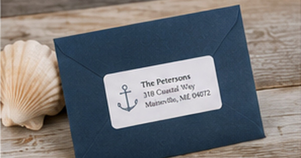
Coastal and Nautical Address Label Designs: A Practical Style Guide
Posted by Affordable Address Labels on May 11th 2024
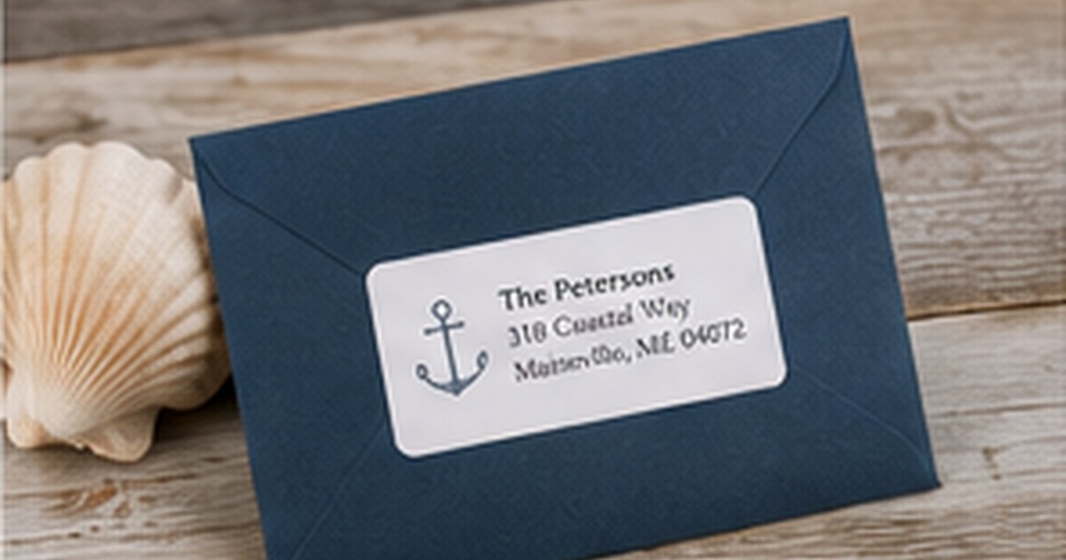
Coastal address labels can feel crisp, relaxed, and personal without turning every envelope into a beach souvenir. The strongest designs borrow a few recognizable details—navy, sea-glass tones, rope lines, shells, anchors, or waves—and use them with restraint.
A practical coastal label should still work in October, fit the actual address, and remain readable on the chosen envelope. That requires a little more planning than selecting the first design with an anchor.
Choose a coastal direction before choosing icons
Coastal style includes several distinct moods. New England nautical may use navy, white, red accents, stripes, and traditional serif type. A beach-house look may favor sand, aqua, coral, driftwood, and casual lettering. A modern coastal design may use a single line-drawn shell or wave with generous white space.
Defining the direction prevents unrelated motifs from piling up. Anchors, lighthouses, starfish, palm trees, and sailboats do not all need to appear together. One clear symbol gives the name and address room to breathe.
Use color that works with real envelopes
Navy is versatile because it reads almost like a neutral and remains clear on white, cream, pale blue, and kraft envelopes. Sea-glass green and aqua provide freshness but may need darker type for contrast. Coral and red are effective accents when used sparingly.
If the label has a colored background, test it against the envelope rather than viewing it alone. A pale blue label can disappear on a similar envelope; a white label with navy details may create a cleaner result.
Balance decorative type with postal clarity
Casual scripts can suggest handwritten beach-house notes, but long street names and city lines need a typeface with open shapes. Use the script for the family name or a short phrase and a serif or sans serif for the postal address.
Avoid overly compressed layouts shaped like anchors, boats, or circles if they force the address into an unusual reading order. A familiar three-line address is easier to proof and easier for recipients to recognize.
Make the design useful beyond vacation season
A year-round coastal design usually relies on color and texture more than seasonal wording. “The Petersons” with a small anchor can work on thank-you notes, invoices from a waterfront business, summer invitations, and December cards. Labels that say “Beach Days” or use tropical holiday motifs are better ordered in smaller quantities.
People with a second home should decide which address and household name belong on each supply. Store separate sets in clearly marked folders to prevent using the vacation address on everyday mail.
Evaluate the finished label in real use
Before committing to a large reorder, place the label on several envelopes and view it at normal reading distance. Check the longest address, the darkest envelope, and the occasion where the design will be used most often. A full-size test catches spacing and contrast problems that an enlarged preview can hide.
Store the approved design name, quantity, and order date with a photo of the finished envelope. That record makes later reorders faster and helps the household decide whether the same design still fits after a move, name change, new season, or shift in mailing habits.
Quick checklist
- Select one coastal mood
- Use one main motif
- Keep the postal address in a simple typeface
- Test contrast on the actual envelope
- Choose year-round wording for larger quantities
- Separate primary-home and vacation-home supplies
Frequently asked questions
Are anchors appropriate if I do not own a boat?
Yes. Nautical motifs are widely used as a style reference, but a shell, wave, or simple stripe may feel more natural if boating is not part of your life.
What envelope colors work best?
White, cream, kraft, pale blue, and navy are reliable options. The label should be distinct from the envelope while sharing at least one color or tone.
Can a coastal label look formal?
Yes. A restrained navy-and-cream palette, fine border, and classic serif can feel elegant enough for wedding correspondence or professional notes.
Keep the coast in the details
A memorable nautical label does not need a collection of beach symbols. Start with readable type, one coastal cue, and a palette that works with the envelopes you already own. Explore personalized address labels and coordinate them with greeting cards for summer invitations, vacation-home notes, and year-round correspondence.