
Clear Address Labels on Colored Envelopes: Contrast and Placement
Posted by Affordable Address Labels on Feb 19th 2024
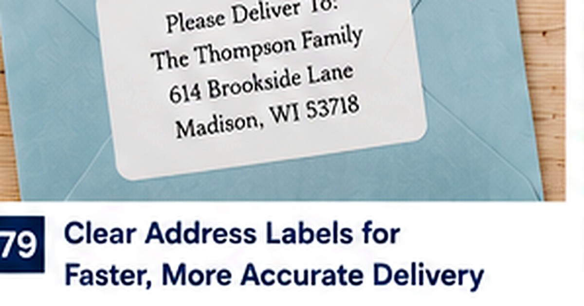
Clear labels allow the envelope color to become part of the design, creating a printed-on appearance without custom envelope printing. The effect can be elegant, but transparency also exposes every contrast and application problem.
A clear label should disappear visually while the address remains easy to read. That requires the right envelope color, strong typography, and careful placement.
Test contrast against the actual envelope
Black or dark charcoal print works well on light and mid-tone envelopes. Dark navy, burgundy, forest, and heavily patterned papers may make clear-label text difficult to read. Place a full-size sample on the real stock before ordering a large quantity.
Consider matte versus glossy surfaces
A glossy clear label on a matte envelope may remain visible under light, while a matte label may blend more naturally. Coated and textured envelopes can also affect adhesion. The goal is not perfect invisibility but a clean, intentional appearance.
Keep the design simple
Fine pale artwork, thin scripts, and delicate borders may disappear when the envelope color shows through. Use clear type, adequate spacing, and one strong accent. Simplicity makes the transparent effect more convincing.
Apply from one edge to avoid bubbles
Align the label before the adhesive touches the surface, then smooth it gradually from one side. Pressing the center first can trap air. Clean, dry envelopes provide the best adhesion.
Choose placement that supports postal readability
Keep return labels away from seams and heavy decorative areas. The upper-left front or back flap can work depending on the mailing style, but the label should not interfere with recipient addressing or postage.
Common label mistakes to avoid
The most common problems with clear address labels colored envelopes come from choosing appearance before function. Text is reduced until it is difficult to read, decorative elements compete with the address, or a label is ordered without testing the longest name and darkest envelope. Another mistake is ordering a large quantity before the wording and location are stable. Use an actual-size proof and judge the label in the setting where it will be used, not only as an enlarged image on a screen.
Test the design on real materials
Apply a sample to the smallest envelope, darkest paper, or most textured surface in the planned set. Complete the piece with recipient addressing and postage so spacing can be evaluated honestly. Ask another person to read the name and address without help. Test on the actual envelope color should be obvious at normal viewing distance. Testing one finished piece is inexpensive compared with discovering the problem after every envelope has been assembled.
Review quantity, storage, and future use
Labels remain useful only when the information stays accurate and the sheets are stored well. Keep them flat, dry, and grouped with the related stationery. Review the remaining quantity before each major mailing and remove outdated versions. Match the label finish to the paper provides a practical standard for deciding whether to reorder, revise the design, or use a smaller temporary supply. A well-managed label system saves more time than an oversized collection of nearly correct options.
Document the version that works
Once the clear address labels colored envelopes setup has been tested, save the exact wording, dimensions, image choice, order date, and quantity in a simple household or business file. Include a photograph of the finished piece and note any changes you would make next time. This record shortens future proofing, prevents old addresses or names from returning, and makes reordering easier for another family member or employee. Good documentation turns a one-time stationery decision into a dependable repeatable process.
Quick checklist
- Test on the actual envelope color
- Match the label finish to the paper
- Use bold readable typography
- Apply slowly from one edge
Frequently asked questions
Do clear labels work on black envelopes?
Usually not without opaque or metallic printing. Standard dark text will have insufficient contrast.
Will the edge of the label be visible?
Often slightly, especially under angled light. Good finish matching and clean application minimize it.
Can clear labels be placed over envelope seams?
Avoid seams when possible because they can create lifting and visible ridges.
Put the system into practice
A clear plan makes stationery easier to use and easier to reorder. Review the wording at actual size, choose a realistic quantity, and explore personalized address labels that fit the way the household or business actually communicates.