
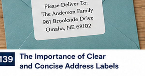
Clear Address Label Typography: Font Size, Spacing, and Contrast
Posted by Affordable Address Labels on Jan 13th 2025
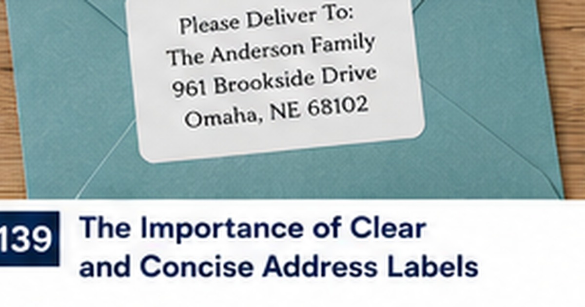
Typography determines whether an address label works before color, artwork, or style has a chance to matter. A beautiful design fails when the street line is too small, the script letters collide, or the text disappears against the background.
Clear typography does not require a boring label. It requires a hierarchy that separates decorative personality from essential mailing information.
Choose fonts with dependable letter shapes
The address lines should use a font with clear numbers, punctuation, and capital letters. Watch for confusion between 1 and I, 0 and O, or tightly joined script characters. Decorative fonts can appear in the name line or accent, while the street, city, state, and ZIP remain in a highly readable face.
For this part of the project, use a real sample instead of relying only on a screen preview. Check the wording, size, placement, and workflow with the people who will actually use it. A small test often reveals an issue before it affects an entire order or mailing.
Set size based on the smallest line
Designers often focus on the large household name and overlook the reduced city-state-ZIP line. Review the smallest text at actual printed size. If it is difficult to read on screen without zooming out to reality, increase the type or choose a larger label. Do not solve a space problem by shrinking essential information.
For this part of the project, use a real sample instead of relying only on a screen preview. Check the wording, size, placement, and workflow with the people who will actually use it. A small test often reveals an issue before it affects an entire order or mailing.
Use spacing to create hierarchy
Line spacing, margins, and alignment help the eye understand the label quickly. Leave enough space between the name and address without separating them into unrelated blocks. Keep the text away from rounded corners, borders, and illustrations. Balanced empty space makes the label feel intentional and improves readability.
For this part of the project, use a real sample instead of relying only on a screen preview. Check the wording, size, placement, and workflow with the people who will actually use it. A small test often reveals an issue before it affects an entire order or mailing.
Protect contrast from decorative backgrounds
Place text on a calm area with strong contrast. Patterns, watercolor washes, and photographs may be attractive but can break the edges of letters. Use a solid panel, lighter section, or restrained border so the address remains distinct. Matte finishes also reduce glare that can interfere with quick reading.
For this part of the project, use a real sample instead of relying only on a screen preview. Check the wording, size, placement, and workflow with the people who will actually use it. A small test often reveals an issue before it affects an entire order or mailing.
Proof using the longest real address
Samples often use short placeholder names and streets. Test the actual longest household name, apartment line, and city in the order. Print or view the proof at true size and place it on the smallest envelope you use. Real content reveals spacing problems that a generic sample cannot show.
For this part of the project, use a real sample instead of relying only on a screen preview. Check the wording, size, placement, and workflow with the people who will actually use it. A small test often reveals an issue before it affects an entire order or mailing.
Quick checklist
- Use clear fonts for essential lines
- Judge the smallest text first
- Leave deliberate line and edge spacing
- Maintain strong contrast
- Proof the longest real address at actual size
Frequently asked questions
Can script be used on an address label?
Yes for a name or accent, but essential address lines are usually clearer in a simpler font.
Is centered or left-aligned text better?
Both can work. Left alignment is often easiest for long addresses, while centered layouts suit balanced short designs.
Why does the printed label look smaller than the screen proof?
Screens often display artwork enlarged. Always review at actual physical dimensions before approval.
Build a dependable stationery system
Good labels and paper goods make communication easier when the design supports the real task. Review personalized address labels to create a coordinated solution that is readable, useful, and appropriate for the occasion.