
Address Label Layout: Spacing, Abbreviations, and Line Breaks That Improve Clarity
Posted by Affordable Address Labels on Mar 18th 2025
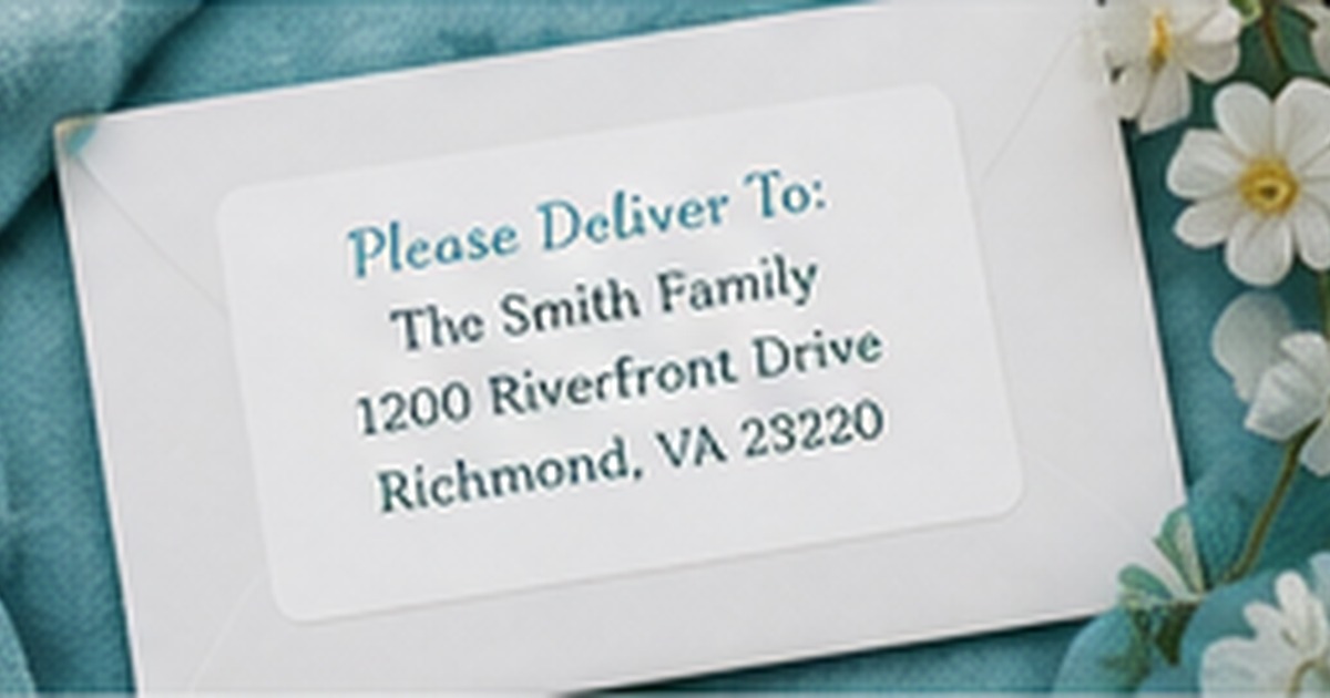
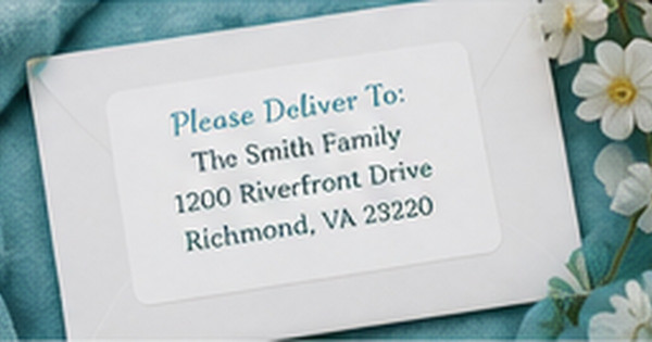
A readable address label looks simple because the layout decisions have already been solved. Names, street details, city, state, and ZIP code need a clear hierarchy that works at small size and on different envelope colors.
The goal is not to decorate the postal information. It is to present the correct details in a format that a person can scan quickly and that fits the label without crowding.
Give each information group a clear line
Keep the recipient or sender name separate from the street line, and place city, state, and ZIP together when space allows. Apartment, suite, or unit details should be visible rather than squeezed into punctuation. Consistent line structure makes errors easier to spot during proofing.
Use abbreviations consistently
Decide whether the design uses common street and state abbreviations, then apply the choice throughout. Mixing “Street” on one line with “Rd.” on another can look accidental. Accuracy matters more than style, so verify the official address before shortening any component.
Protect the smallest text from decorative competition
Borders, icons, and scripts should not force address lines below a comfortable reading size. If the longest street or city name barely fits, simplify the decorative element or choose a wider label. A strong design treats readability as part of the visual quality.
Check contrast, margins, and application tolerance
Leave enough space around the text so a slightly off-center application does not cut into the design. Test the label on the lightest and darkest envelopes you use. A small margin and strong contrast make the label more forgiving in real-world use.
Choose the label shape after the text
Shape should serve the real address rather than forcing the wording into a decorative outline. Rectangles handle long lines well, while squares and ovals favor shorter text and stronger visual motifs. For address label layout, compare options using the actual names and address before selecting the shape.
Plan a primary and secondary use
An everyday label may also support thank-you notes, invitations, school mail, or packages. Define the primary job and one realistic secondary use. This keeps address label layout: spacing, abbreviations, and line breaks that improve clarity versatile without making it generic. A design trying to fit every possible occasion often loses the personality that made it appealing.
Review the first twenty uses
After the label has been used on several envelope sizes and colors, note any repeated problem: small type, awkward placement, weak contrast, or too little room. Save those observations with the proof. The next reorder is an opportunity to refine the design rather than automatically duplicating it.
Mistakes that make a good label less useful
Even a strong design for address label layout can disappoint when the practical details are skipped. Avoid ordering from a sample address without testing the longest real line, shrinking type to preserve decoration, or choosing a material before checking the envelope or container surface. Do not assume the screen color will behave the same on kraft, dark, glossy, or textured paper. Check spelling and ZIP code from a reliable source, and make one full-size sample before approving quantity. Store the final proof and order details so address label layout: spacing, abbreviations, and line breaks that improve clarity can be reordered accurately. These small controls protect readability, reduce waste, and make the label dependable beyond the first attractive photograph.
Quick checklist
- Separate name, street, and city-state-ZIP information clearly
- Use abbreviations consistently
- Do not shrink essential text to preserve decoration
- Leave practical margins around the address block
Frequently asked questions
Should every address use three lines?
Not necessarily. The number of lines depends on the name, secondary unit information, and available space.
Is all-uppercase text required?
No. Clear mixed-case or uppercase text can both be readable when spacing and contrast are strong.
Where should apartment information appear?
Include it as part of the delivery address in a clear, consistent location rather than omitting or hiding it.
Make the next mailing easier
A clear system turns the next envelope, package, or note into a repeatable task rather than a new design problem. Explore personalized address labels to coordinate the practical details with a polished finished look.