
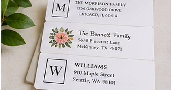
2026 Address Label Design Ideas: Color, Type, and Layout
Posted by Affordable Address Labels on Jul 7th 2018
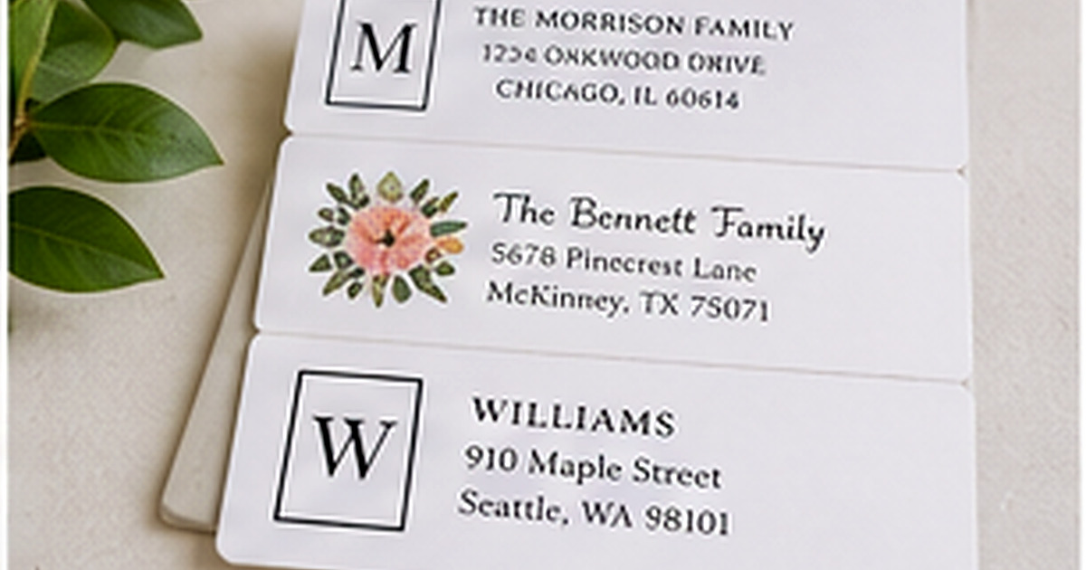
Address label design in 2026 is less about chasing a single trend and more about combining personality with clarity. Warm neutrals, restrained botanicals, expressive typography, and confident color accents can make small labels feel current without shortening their useful life.
The most successful ideas still respect the scale of the product. A label may be viewed for only a second as an envelope is handled, so the address needs strong contrast and a clear hierarchy even when the design feels artistic.
Warm, natural color palettes
Cream, clay, muted green, dusty blue, cocoa, and soft gold continue to pair well with stationery because they feel personal and adaptable. Rather than using several pale colors together, add one darker ink color to protect readability.
Seasonal color can be introduced through a small border, icon, or name line. This gives the label character without making the entire design difficult to use outside one month.
Personality through type, not clutter
A distinctive serif, relaxed handwritten accent, or slightly condensed sans serif can carry more personality than a collection of decorative graphics. One expressive type decision lets the rest of the label stay clean.
Variable font families and broad type collections make it easier to coordinate several products while keeping each one readable. The name can be more expressive; the address should remain stable and familiar.
Flexible botanical and line-art details
Small branches, wildflowers, house outlines, and simple regional motifs remain popular because they add meaning without dominating the label. Fine line art needs enough stroke weight to print clearly, especially on textured or absorbent stock.
Consider asymmetrical placement rather than centering every element. A small motif on one side can create visual interest and leave more horizontal room for a long name or street.
Layouts designed for real addresses
Modern labels increasingly accommodate apartment lines, two surnames, and long city names instead of assuming every address fits a short three-line template. Flexible alignment and slightly wider formats make personalization feel intentional rather than squeezed.
Before choosing a trend-led design, insert the actual longest line of the address. The design should adapt to the household, not force important information into tiny type.
Ways to make a current design last
- Choose one trend-led feature
- Keep the address high contrast
- Use an all-season base color
- Limit decorative motifs
- Proof the longest line first
- Avoid date-specific wording unless intentional
Review the design in the context where it will be used
Place a printed sample of the 2026 address label design ideas on the actual envelope, card, container, or package. Scale, color, and spacing can feel very different on a real object than they do in an enlarged online preview. The surrounding materials should support the design rather than compete with it.
Read every personalized line aloud and compare the address against a trusted source. Check names, abbreviations, apartment numbers, ZIP codes, and punctuation. When two people share the proofing task, one can read the original information while the other checks the final design line by line.
Finally, decide how the item will be stored and reordered. Save the design name, product number, quantity, and order date. That information turns a successful first purchase into a dependable part of the household stationery routine.
Common mistakes to avoid
- Choosing style before confirming the wording
- Reducing type until a long line barely fits
- Using too many fonts or decorative elements
- Ignoring the color of the final envelope or surface
- Ordering a large quantity before testing one sample
A careful proof and a small real-world test prevent most of these problems. Make the design attractive, but let accuracy, readability, and ease of use guide the final decision.
Frequently asked questions
Are minimalist labels still current?
Yes. Minimalism remains useful because it emphasizes type, spacing, and materials rather than temporary graphics.
What colors are easiest to use year-round?
Warm neutrals, navy, deep green, soft blue, and black work across seasons and envelope colors.
Can a trendy script date a label quickly?
It can. Use expressive script as a small accent and pair it with a timeless, readable address font.
Should labels match the home décor?
They can reflect personal taste, but they do not need to match a room. Consider the cards, envelopes, and occasions where the labels will appear.
Build a stationery system that fits real life
The best personalized paper goods are the ones you reach for often. Choose clear, accurate designs, store them where correspondence happens, and reorder before a holiday or event creates a rush. Explore personalized address labels, rubber stamps, and greeting cards to create a practical set for home, celebrations, or business mail.